
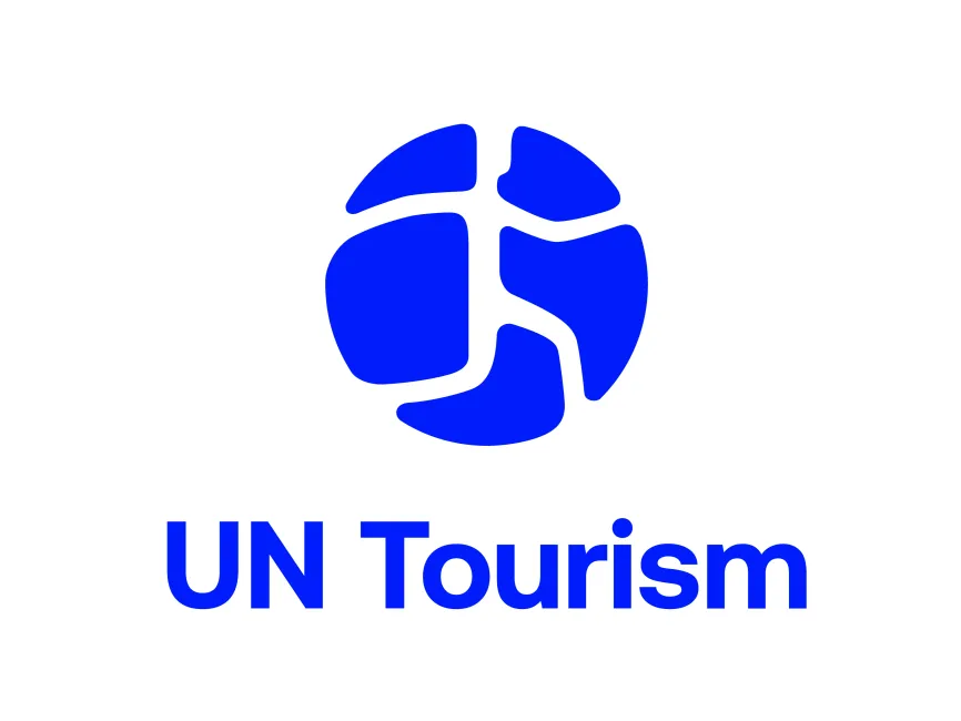
UN Tourism Logo
Information
Description
In a significant rebranding initiative, the World Tourism Organization (UNWTO) has officially adopted a new name and identity: UN Tourism This transformation, developed in partnership with global branding agency Interbrand, marks a bold step toward repositioning the organization as a forward-looking institution shaping the future of tourism worldwide
The new visual identity reflects UN Tourism’s renewed mission—to guide the global tourism sector in becoming more sustainable, resilient, and inclusive The rebrand aligns with the increasing relevance of travel and tourism as key drivers of cultural understanding, economic development, and environmental responsibility
UN Tourism (formerly UNWTO) is a United Nations specialized agency responsible for promoting responsible, sustainable, and universally accessible tourism It was originally established in 1975 and is headquartered in Madrid, Spain The organization provides leadership and support to the international tourism sector, working closely with governments, industry stakeholders, and local communities
At the heart of the new identity is a dynamic globe-like symbol, divided into fluid, interconnected segments This modern icon is both abstract and metaphorical—visually evoking a globe, maps, roads, and networks—all of which symbolize movement, exploration, and human connection
The emblem effectively communicates the values of connectivity, diversity, and global unity, making it highly relevant in the context of international tourism Its rounded forms and intersecting lines convey a sense of flow and adaptability, essential traits for a sector constantly evolving in response to global challenges
The new identity adopts a striking electric blue as its core color This tone is bright, modern, and highly visible, evoking trust, professionalism, and forward-thinking leadership Blue also connects strongly with the UN’s broader visual language, ensuring institutional coherence
The accompanying typography is clean, geometric, and sans-serif, which complements the logo’s minimal and fluid structure The text “UN Tourism” is set in a bold and legible font, reinforcing clarity and authority across all communication channels
The shift from UNWTO to UN Tourism is a strategic move to increase brand clarity and accessibility Acronyms can be confusing and alienating to the general public, while “UN Tourism” immediately communicates the organization’s core mission It also aligns the agency more closely with other high-profile UN entities that have adopted simpler naming conventions for broader recognition
User reviews