
Direct Ferries Logo
Information
Description
Direct Ferries is a global ferry ticketing platform headquartered in the United Kingdom Established in 1999, the company was created with the aim of simplifying the ferry booking process by offering a digital comparison tool for routes, operators, and prices Direct Ferries partners with over 270 ferry operators worldwide, covering more than 4,000 routes across Europe, Asia, North Africa, and the Americas
The platform serves millions of customers annually and is recognized for its user-friendly interface and extensive ferry network Direct Ferries continues to expand its global presence while maintaining a focus on seamless digital experiences for travelers
Over the years, the Direct Ferries logo has gone through refinements in line with modern digital design standards The original logo featured more literal visual elements relating to maritime themes In contrast, the current version embraces a more minimalist and versatile visual identity that aligns with the brand's digital-first nature
The new logo represents a shift toward simplicity, adaptability, and digital optimization—ensuring consistent visibility and recognition across mobile, desktop, and printed formats
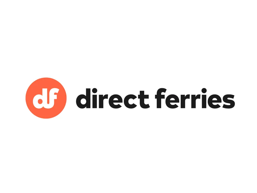
The Direct Ferries logo is a combination mark, integrating both an emblem and logotype The emblem features the lowercase initials "df" inside a solid circle, while the wordmark “direct ferries” appears in bold, lowercase letters to the right This approach strengthens brand recognition by combining iconic simplicity with a clear brand name
The font used in the wordmark is a rounded, geometric sans-serif typeface It gives off a friendly and approachable appearance, which is ideal for a travel-related service The use of lowercase letters enhances the sense of accessibility and modernity, a common choice among digital-first companies aiming for a user-friendly image
The primary colors used are coral orange and black The coral circle containing the initials offers a warm and inviting feel, invoking a sense of travel and adventure This vibrant tone helps draw attention while maintaining a clean aesthetic The black text ensures legibility and professionalism
The circular emblem symbolizes inclusiveness, continuity, and global reach—fitting for a brand operating internationally The initials “df” are creatively merged and centered, emphasizing brand abbreviation and memorability The contrast between the coral and white in the emblem ensures high visibility, particularly on digital platforms

User reviews