
Colere Logo
Information
Description
Colere is a renowned mountain resort and tourism destination located in the Val di Scalve area, within the Presolana mountain range in Lombardy, Italy This alpine village is especially popular for winter sports such as skiing and snowboarding, but it also offers summer hiking, climbing, and nature-based tourism Colere is part of the Bergamo Alps and is known for its breathtaking scenery, well-managed ski infrastructure, and welcoming local culture
The region has grown significantly in popularity among both Italian and international tourists Recent years have seen investments in revitalizing its image and facilities to attract a broader, year-round audience beyond just the winter season
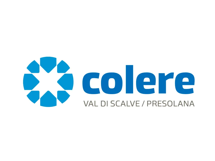
The new Colere logo represents a visual refresh aimed at modernizing the resort's image While older versions of the logo may have featured more traditional alpine or ski-related symbols, the updated design embraces a clean, professional look that’s more in tune with the expectations of contemporary travelers
The rebranding reflects Colere’s intent to be recognized not only as a ski destination but as a four-season alpine resort focused on sports, wellness, and eco-tourism
This is a combination logo, including both a symbol and a wordmark The design is highly geometric and contemporary, emphasizing symmetry and clarity The accompanying text uses a bold sans-serif font, giving the brand a modern, strong presence
The circular icon to the left of the wordmark is composed of eight geometric shapes arranged in a radial pattern, forming a snowflake-like design that also resembles a mountain star This evokes associations with snow, mountains, and winter—all core elements of Colere’s identity
The inward-facing design gives a sense of unity and focus, symbolizing Colere as a hub of activity and convergence in the region The logo cleverly balances movement and stability, qualities that reflect both adventure and dependable infrastructure
The typeface used for “colere” is a clean, rounded sans-serif font It conveys friendliness, clarity, and modernity The use of lowercase letters emphasizes accessibility and casual sophistication, making the brand feel more personal and less institutional


User reviews