
Resend Logo
Information
Description
Resend is a modern SaaS company focused on developer-friendly email infrastructure The platform provides APIs and tools for sending, receiving, and managing transactional and marketing emails at scale, making it easier for businesses to integrate email functionality into their applications Founded in the early 2020s, Resend is part of a new generation of software infrastructure companies that prioritize simplicity, performance, and a seamless developer experience With a mission to modernize how businesses communicate with their users, Resend continues to grow rapidly, serving a diverse range of startups and enterprises worldwide
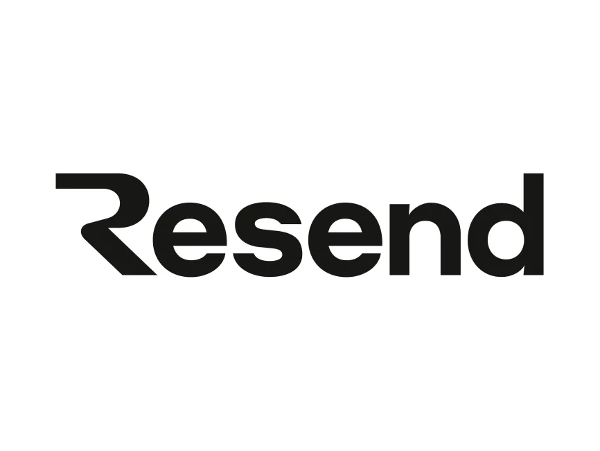
As a technology brand, Resend’s visual identity is designed for clarity, flexibility, and strong digital presence The current logo represents a clean and confident break from traditional email-related imagery, embracing a minimalist, typographic approach This reflects Resend’s core values: reliability, efficiency, and modernity Since Resend is a relatively new company, its logo has not undergone significant changes, but the design perfectly aligns with current tech branding trends, focusing on simplicity and scalability
The Resend logo is a striking example of a modern wordmark, relying solely on custom typography for brand recognition The most distinctive element is the stylized “R” at the beginning of the logo The “R” features geometric, angular lines and a cut-out design that subtly evokes the idea of movement or “resending” — a smart visual metaphor for the brand’s core service This custom “R” gives the logo a dynamic and unique personality, instantly setting it apart from generic tech marks
The remaining letters are set in a bold, sans-serif typeface, projecting strength, clarity, and professionalism The use of all lowercase letters (apart from the “R”) conveys approachability and accessibility, important qualities for developer-focused platforms The black color choice is intentional, offering maximum contrast and versatility on both light and dark backgrounds, and reinforcing a sense of modern sophistication
Resend’s logo is a typographic wordmark, leaning entirely on the power of custom font design for brand identity The stylized “R” not only signals the brand name but also cleverly hints at core product features: speed, repetition, and technical precision The sharp lines and bold geometry reinforce the image of a high-performance, reliable tech company
By avoiding icons or literal email imagery, the logo ensures a timeless, non-cliché appearance that remains fresh and relevant as the brand grows and diversifies its product offerings
These high-quality formats make the logo suitable for all digital and print applications, ensuring consistency across branding, presentations, and marketing materials
The Resend logo embodies everything a modern SaaS company aspires to: simplicity, boldness, and distinctive visual identity With its custom-designed “R” and clear, powerful wordmark, the logo communicates trust, innovation, and developer-first thinking As Resend continues to shape the future of email infrastructure, this strong visual identity will play a crucial role in reinforcing the brand’s values and expanding its presence in the competitive tech landscape








User reviews