
Google X Logo
Information
Description
Google X, now officially known as X, the moonshot factory, is a semi-secret research and development subsidiary of Alphabet Inc It was founded in 2010 as a part of Google's long-term innovation strategy and aims to create breakthrough technologies to solve global problems Often referred to as simply "X", the division has been the cradle of revolutionary projects like Waymo (self-driving cars), Project Loon (internet balloons), and Wing (drone delivery)
X was founded by Google’s co-founders Larry Page and Sergey Brin, alongside Sebastian Thrun, a computer scientist and former Stanford professor Originally conceptualized as an experimental lab, it became a separate Alphabet subsidiary during Google’s corporate restructuring in 2015 With the mission to “solve the world’s hardest problems through radical technology,” X continues to be the frontier for futuristic innovations under Alphabet
The original logo of Google X featured a highly stylized and minimalistic "X", often accompanied by the word “Google” to emphasize its connection to the tech giant As the entity evolved and rebranded simply to "X", the logo also underwent significant refinement The most recent rebranding reflects a more independent, bold, and futuristic identity—one that aligns with its moonshot goals and distinct separation from the core Google brand
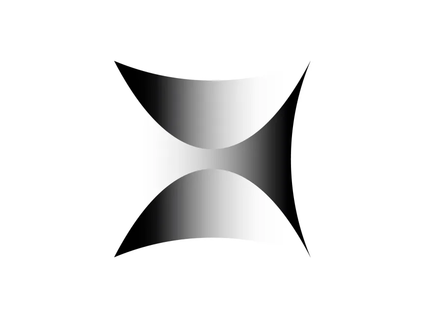
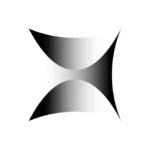
The current logo is a geometric, abstract representation of the letter "X", constructed from clean lines and sharp angles It can be classified as a lettermark logo, relying solely on the initial "X" without accompanying text or imagery This minimalistic approach conveys modernity, efficiency, and forward-thinking
The predominant color of the new X logo is black or dark gray, depending on its usage context This monochromatic scheme enhances the logo’s sophistication and adaptability across digital and physical media The choice of black also communicates authority, innovation, and seriousness—qualities aligned with its mission of tackling complex, global-scale problems
The design of the "X" often uses negative space to create an illusion of motion or depth Its symmetrical yet sharp structure suggests precision and engineering excellence, suitable for a research lab The abstraction in the shape implies innovation, leaving room for interpretation—much like the moonshots it pursues
The logo avoids traditional typography altogether When text is used in branding collateral, it’s often presented in a modern sans-serif font, maintaining a futuristic and minimalist visual language
From a branding and design standpoint, the new X logo succeeds in distilling a complex identity into a simple, recognizable mark Its abstract form is memorable, scalable, and versatile across digital platforms The design communicates a bold, experimental spirit while maintaining a professional and sleek aesthetic This is crucial for a brand aiming to be taken seriously in scientific and technological innovation


User reviews