
Files.com Logo
Information
Description
Files.com is a cloud-based file transfer and automation platform that serves businesses seeking secure, efficient, and centralized file exchange The company provides a hybrid of managed file transfer (MFT), cloud storage, and automation features, making it ideal for enterprises needing to transfer large volumes of data with high reliability Originally founded in 2009 under the name BrickFTP, the company rebranded as Files.com in 2019 to better reflect its expanded service offering The company is headquartered in the United States and has built a strong reputation among IT professionals for its security-first infrastructure and flexibility
The original identity of the company under the BrickFTP name emphasized secure FTP solutions With the pivot to Files.com, the rebranding aimed to present a broader vision of file management beyond FTP, covering cloud integration, automated workflows, and scalable file infrastructure This shift was also reflected in a more modern and bold visual identity to align with enterprise-level cloud service aesthetics
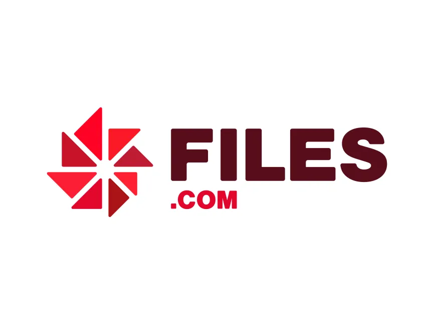
The Files.com logo is a sophisticated combination of geometric precision and modern branding principles It incorporates both an icon and logotype, allowing for flexible use across digital and print media
The left icon features a pinwheel-style geometric figure composed of eight red triangular elements forming a circular motion This design evokes a sense of movement, dynamism, and digital transformation—core principles of a cloud-based file automation service The shape resembles both a data flow symbol and a stylized asterisk, often used in tech branding to signify connectivity and extensibility
The red shades used in the symbol transition from bright red to a darker maroon, creating visual depth and representing gradient transformation—a nod to data processing or file transitions
The word “FILES” is rendered in a bold, uppercase sans-serif typeface, exuding strength, reliability, and professionalism The deep maroon color used here suggests seriousness and enterprise-level trust Below it, “.COM” is displayed in a bright red color, emphasizing the digital and web-based nature of the brand
This two-tone approach not only differentiates elements of the brand name but also adds visual interest The simplicity and clarity of the typeface make it readable and recognizable even at smaller scales
The Files.com logo falls under the category of a combination mark, integrating both an icon and textual brand name This allows the symbol to be used independently in mobile app icons, favicons, or other minimalist digital spaces, while the full logo remains optimal for websites, email signatures, and marketing materials


User reviews