
Quidget Logo
Information
Description
Quidget is a conversational AI platform that empowers organizations to build and manage real-time, voice-enabled customer experiences With a focus on voice automation and AI-driven interactions, Quidget helps businesses enhance support, sales, and engagement by integrating natural, human-like conversation flows into their digital channels
Positioned at the intersection of AI and telephony, Quidget aims to simplify complex customer journeys and increase efficiency through scalable, intelligent virtual agents The platform is especially known for integrating with services like Twilio, Google Dialogflow, and other voice and messaging APIs
Quidget is part of the new generation of customer communication tools, emphasizing flexibility, automation, and seamless UX
As a tech-forward and modern SaaS company, Quidget’s brand identity has been designed from the ground up to reflect clarity, intelligence, and modularity There is no publicly documented history of logo redesigns, indicating that the current branding likely represents the company’s foundational visual system
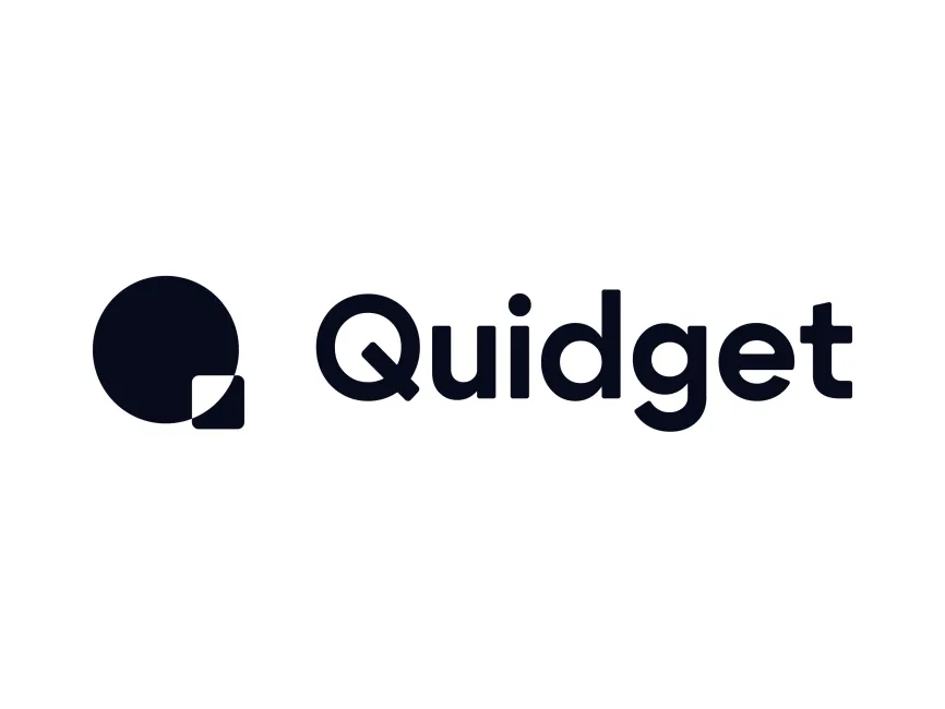
The current logo is clean, minimalist, and geometric, a strong reflection of both digital precision and approachable innovation
The icon to the left of the wordmark is abstract yet meaningful It consists of a large filled circle intersected by a smaller, rounded square This simple geometric combination subtly conveys the idea of modularity and integration — key principles in API-based platforms like Quidget
The circle can symbolize completeness, unity, or seamless communication, while the overlapping square introduces contrast and structure, implying flexibility and building blocks — important for customizable platforms
When viewed creatively, the overall shape also hints at the letter Q, cleverly reinforcing brand recognition in a visually minimalist way


User reviews