
Wiz Logo
Information
Description
Wiz is a cloud security company that helps enterprises identify and mitigate risks in cloud environments Founded in 2020 by Assaf Rappaport, Ami Luttwak, Yinon Costica, and Roy Reznik, Wiz has rapidly become a major player in cybersecurity The company provides a comprehensive cloud security platform that offers deep visibility and risk assessment across cloud infrastructure, applications, and workloads
In a groundbreaking move, Google’s parent company, Alphabet, announced the acquisition of Wiz for $32 billion This marks one of the largest cybersecurity acquisitions in history and is expected to strengthen Google Cloud’s security offerings
This acquisition reflects Google's commitment to cloud security and its strategy to compete with AWS and Microsoft Azure With Wiz’s advanced threat detection and cloud security solutions, Google aims to provide enhanced security features for enterprise customers
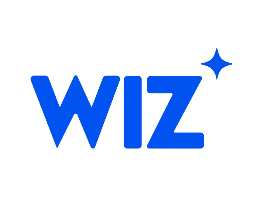
The Wiz logo features a bold, sans-serif typeface that exudes strength, modernity, and clarity The thick, well-spaced letters ensure high readability, while the slightly rounded edges create a friendly and approachable look
The logo is designed in a vibrant blue, a color widely associated with trust, technology, and reliability Blue is commonly used in tech and security industries as it conveys a sense of stability and dependability—qualities that are crucial for a cybersecurity company
A notable feature of the logo is the small spark icon above the letter “Z” This abstract star-like shape symbolizes
The Wiz logo is a wordmark with an abstract icon The focus remains on the brand name, ensuring strong recall, while the spark icon adds personality and uniqueness
Since Wiz is a relatively young company, its logo has remained consistent since its launch The current design effectively represents the brand’s core values, making major changes unnecessary However, with Google's acquisition, there could be slight refinements or rebranding efforts in the future




User reviews