
Accessibility Partner Logo
Information
Description
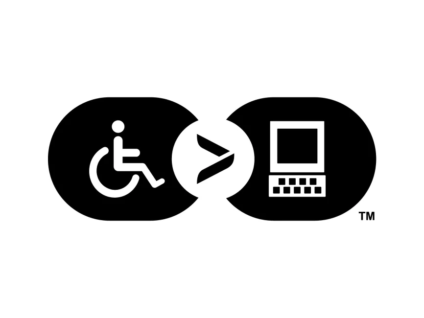
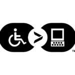
The Accessibility Partner logo represents a commitment to digital accessibility and inclusion for individuals with disabilities It symbolizes the importance of creating equal opportunities in the digital space, ensuring that technology is accessible to all This type of branding is often associated with organizations that advocate for accessibility in web design, software, and digital tools
The logo consists of three primary elements
The connection between these elements visually communicates the importance of bridging the gap between disabilities and digital access
The monochrome black-and-white palette enhances clarity, simplicity, and professionalism Black conveys strength and authority, while white provides contrast for readability and universal recognition This minimalistic approach ensures high accessibility and scalability across different media formats
This is an icon-based combination mark, meaning it relies on symbols rather than words The simple, flat design makes it effective for
The Accessibility Partner logo effectively communicates the mission of digital accessibility and inclusivity The combination of the wheelchair symbol, greater-than sign, and computer icon visually represents the idea that technology should empower, not exclude


User reviews