
KGL Samling Logo
Information
Description
KGL SAMLING (short for Den Kongelige Samling) translates to The Royal Collection in English It refers to the Danish Royal Collection of art, artifacts, and cultural heritage associated with the Danish monarchy This institution is responsible for the preservation, exhibition, and interpretation of the royal family's vast collection of historical and artistic treasures, housed in notable locations such as Rosenborg Castle, Amalienborg Palace, and Christiansborg Palace
The Royal Collection is an important cultural institution in Denmark, providing public access to centuries of history, royal regalia, portraiture, decorative arts, and archival documents Its mission is to connect the Danish people with their monarchy’s historical legacy while fostering public engagement and education through exhibitions, events, and research
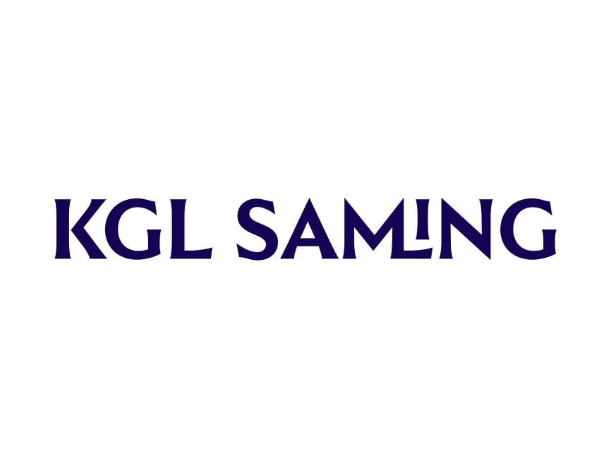
The new KGL SAMLING logo reflects a significant visual rebranding that aims to blend heritage with modernity It symbolizes the institution’s role in maintaining royal tradition while also opening up to new generations and wider audiences The updated design sheds any ornate or overly historic visual cues in favor of a cleaner, yet sophisticated typographic identity
The new KGL SAMLING logo features a custom serif typeface with distinct, sculptural letterforms The typeface is highly stylized, giving each character a carved, chiseled look that evokes classical stone inscriptions—appropriate for an institution steeped in history and culture
The most notable detail in the typography is the creative manipulation of the letter “L” in "SAMLING", which appears almost mirrored or flipped This visual twist gives the logo a subtle uniqueness and contemporary edge, breaking away from predictability without losing readability
The logo uses a deep royal blue or indigo hue, which holds strong associations with royalty, tradition, and prestige The color reinforces the institution’s regal identity while also providing a sense of calm and authority
The solid single-color approach makes the logo versatile across digital, print, and signage applications It’s elegant without being extravagant—a perfect balance for a cultural institution with noble roots
Although the logo does not include a traditional emblem or crown motif, its typographic weight and precision convey authority and heritage The modern serif treatment references both stone carvings and classical typography, which are commonly found in historical architecture and documents This choice bridges past and present, making the logo suitable for a royal collection that continues to evolve




User reviews