
Birmingham Design Festival Logo
Information
Description
Birmingham Design Festival (BDF) is an annual event based in Birmingham, United Kingdom, dedicated to celebrating and showcasing the best in design Launched in 2018, the festival brings together designers, artists, and creatives from various disciplines including graphic design, digital design, illustration, architecture, motion design, and product design The event is organized by a group of design professionals who are passionate about fostering creativity and community engagement within the design industry
Birmingham, a city with deep industrial and design roots, serves as the perfect backdrop for a festival that aims to blend traditional craftsmanship with modern innovation Since its inception, BDF has grown in scale and influence, attracting both local and international talent and audiences
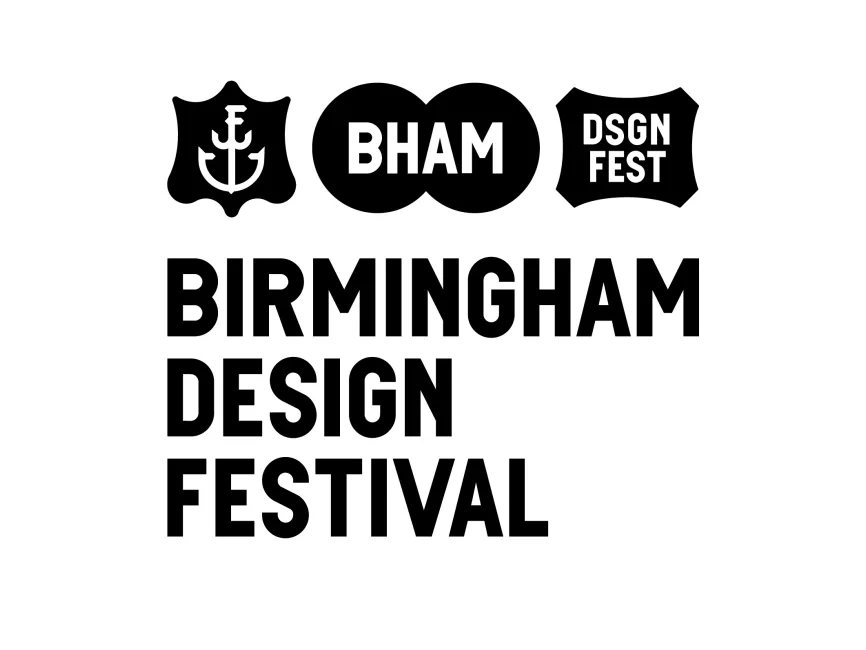
The Birmingham Design Festival logo has remained consistent in its visual identity since the early years of the festival Its design is focused on clarity, boldness, and adaptability Rather than going through multiple redesigns, the logo’s evolution is more about how it is applied across various media and themes each year, rather than a complete transformation This approach supports strong brand recognition while allowing for flexible, creative interpretations within the festival’s branding materials
The logo features a bold, geometric sans-serif typeface with clean lines and uniform spacing The type is uppercase, which conveys authority and presence while remaining approachable due to its rounded, contemporary styling The alignment is left-justified, providing a solid structural balance and easy readability across various formats and sizes
Above the main textual part of the logo, three emblem-style shapes are used These include
A shield shape with an anchor icon, potentially symbolizing strength, grounding, and connection—traits essential to the design community
Two overlapping circles that contain the abbreviation “BHAM” (a common short form of Birmingham), representing unity and intersection
Another shield-like shape with “DSGN FEST” in it, reinforcing the festival theme while playing with minimal typography

User reviews