
AmplifyChange Logo
Information
Description
AmplifyChange is a funding organization dedicated to supporting civil society organizations that advocate for sexual and reproductive health and rights (SRHR) Founded in 2014, AmplifyChange operates globally, particularly in regions where SRHR are under threat or underrepresented, such as Sub-Saharan Africa, South Asia, and the Middle East The organization is headquartered in the UK and functions as a challenge fund, offering grants to grassroots organizations that fight for gender equality, access to contraception, safe abortion, LGBTQ+ rights, and youth-friendly health services
The organization was initially established through a partnership of Nordic and European donors, including the Ministry of Foreign Affairs of the Netherlands and the UK Foreign, Commonwealth & Development Office (FCDO)
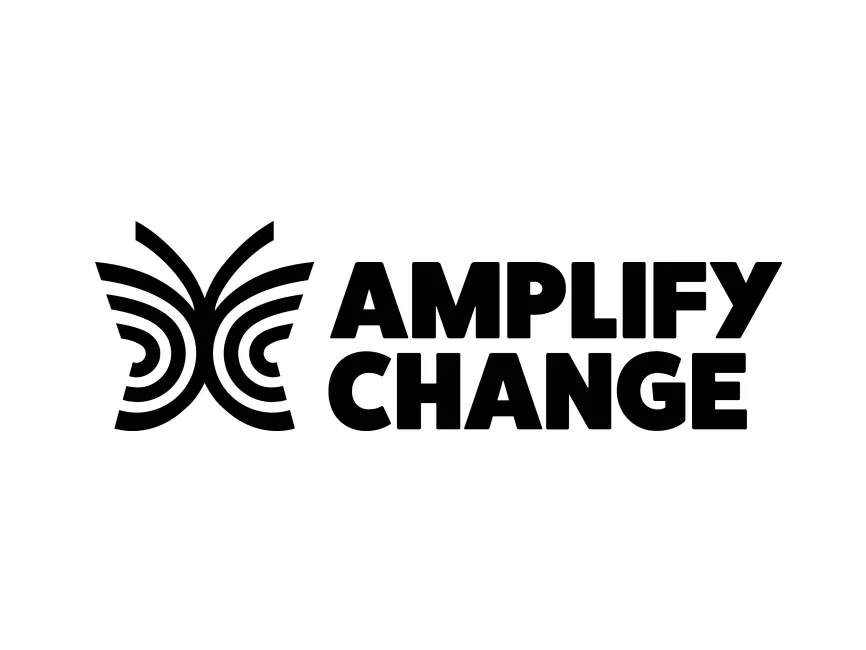
AmplifyChange has recently rebranded its logo to reflect a bolder, more modern, and highly symbolic identity The new logo moves away from earlier visuals that were more static or institutional, and embraces a vibrant, dynamic iconography that symbolizes growth, expansion, and impact
This visual shift aligns with the organization’s evolution from a donor-led initiative to a fully independent and locally driven movement that amplifies the voices of grassroots actors working on SRHR worldwide
The new logo features a combination of a graphic symbol and bold wordmark The icon appears on the left, resembling a butterfly formed from stylized concentric arcs and lines, while the name “AMPLIFY CHANGE” appears in two stacked lines to the right in heavy, uppercase sans-serif typography
This layout ensures strong brand recognition, even at smaller sizes or in monochrome formats
The butterfly shape is an intentional and powerful metaphor In many cultures, butterflies symbolize transformation, growth, and freedom, which aligns closely with AmplifyChange’s mission to create positive change in communities through advocacy
The design also uses radial lines, which resemble sound waves or echo patterns These lines suggest amplification, tying directly to the name "AmplifyChange"—the idea of magnifying voices and broadcasting marginalized perspectives This clever dual symbolism (transformation + amplification) is both aesthetically compelling and deeply aligned with the organization’s values



User reviews