
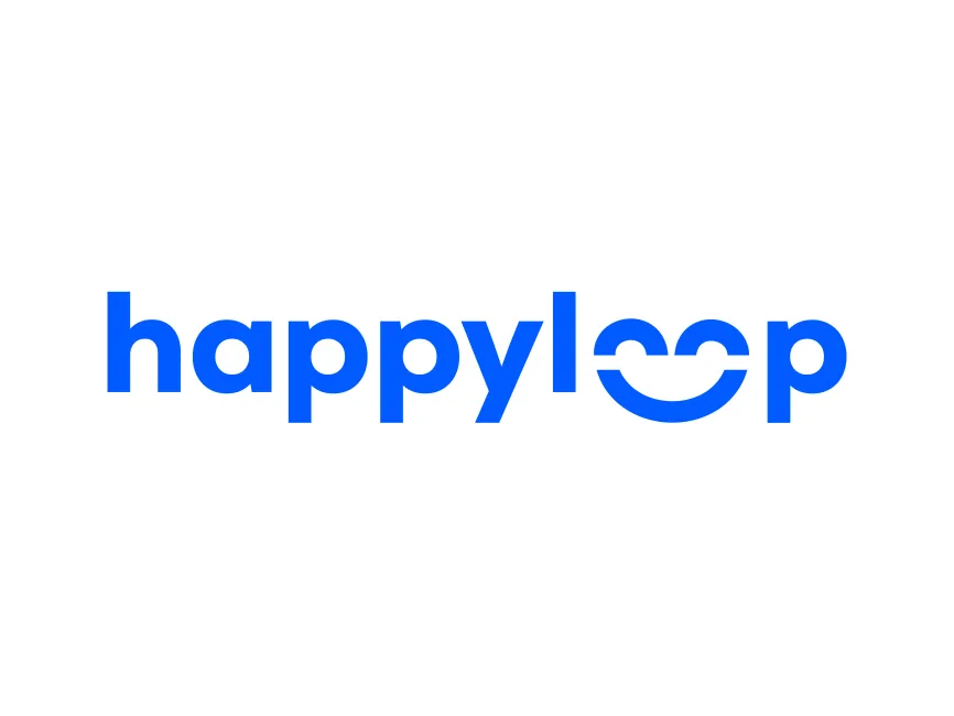
HappyLoop Logo
Information
Description
HappyLoop is a customer experience platform that focuses on transforming feedback into actionable insights to improve customer satisfaction and engagement The platform enables businesses to collect, analyze, and act on customer feedback in real-time, ultimately creating a continuous feedback loop between brands and their customers As the name implies, HappyLoop’s mission is to create a seamless cycle of communication that leads to happier customers and better business outcomes
While HappyLoop is a relatively new player in the CX (customer experience) technology space, it has quickly gained attention for its intuitive interface, user-focused design, and emotionally intelligent branding approach
The HappyLoop logo stands out as a strong representation of the brand’s ethos from its inception There is no known record of significant logo changes or rebranding to date, which suggests that the current design was crafted thoughtfully to serve as a long-term visual identity
The visual identity perfectly blends simplicity with emotional resonance, allowing it to scale effectively across digital platforms while still leaving a memorable impression
The logo features a bold, rounded sans-serif typeface that evokes a sense of friendliness, trust, and modernity Rounded fonts are commonly used in tech and lifestyle brands to convey approachability and simplicity — fitting for a company focused on making customers happy
The most creative design element is found in the word “loop.” The double “o” forms a stylized smile, cleverly using negative space to insert a horizontal line that cuts through both letters and creates a universal symbol of happiness This not only visually reinforces the “happy” in HappyLoop but also symbolizes the continuous, cyclical nature of customer engagement — a key aspect of the brand’s mission
The logo is designed in a vibrant and saturated shade of blue Blue traditionally represents trust, professionalism, and clarity However, the specific hue chosen by HappyLoop feels energetic and fresh — striking a balance between corporate reliability and youthful optimism The color also works well in digital applications, making the logo highly legible and versatile across different screen sizes and backgrounds
The smile embedded within the “loop” isn’t just visually appealing — it encapsulates the brand’s promise of positive outcomes and closed-loop feedback systems It’s a great example of emotional branding, where visual identity triggers a feeling that aligns with the product experience
User reviews