
Brot Logo
Information
Description
Brot für die Welt (Bread for the World) is a globally active development and relief organization based in Germany It was founded in 1959 by the Protestant Church in Germany (Evangelische Kirche in Deutschland, EKD) The organization’s mission is to combat hunger, poverty, and injustice worldwide by supporting sustainable development projects and promoting human rights, social justice, and education
Over the decades, Brot für die Welt has become one of Germany’s most recognized faith-based aid organizations It collaborates with partners in more than 90 countries, focusing on long-term aid rather than emergency relief, advocating systemic change and empowerment of local communities
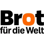
The Brot für die Welt logo has undergone subtle but meaningful updates over time The latest version reflects a cleaner, more contemporary look while maintaining brand recognition
The current logo retains its signature typographic design, with a strong emphasis on clarity and modernity One of the most notable elements in the logo redesign is the use of the color orange in the letter "o" of "Brot", symbolizing warmth, energy, and nourishment — core themes of the organization’s mission
The previous iterations used a more traditional layout and color palette, which has now been replaced by a bolder and more minimalist approach, aligning with modern design trends and enhancing visual impact
The logo is purely wordmark-based, without the use of icons or pictorial symbols This approach reflects a typographic logo style, suitable for organizations where the name itself carries strong brand recognition and credibility
Typography:The typeface is bold and sans-serif, projecting strength, stability, and clarity The differentiation in weight between the words "Brot" and "für die Welt" creates a visual hierarchy, naturally guiding the viewer’s eye
Color Scheme:The color palette includes black and bright orange Black denotes seriousness and authority, appropriate for a humanitarian organization, while the orange "o" adds a distinct character and emotional warmth This contrast not only improves memorability but also conveys a message of hope and vitality




User reviews