
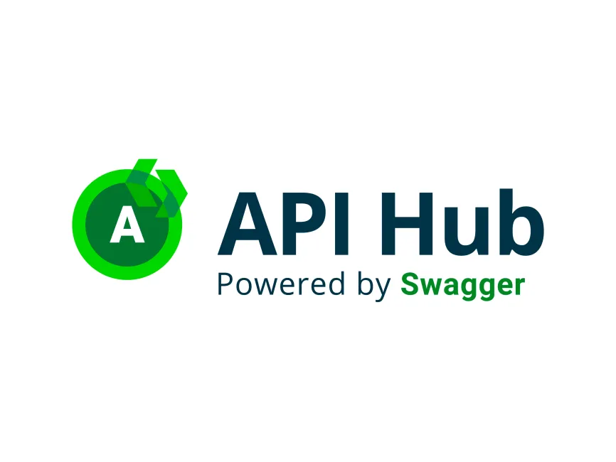
Api Hub Powered by Swagger Logo
Information
Description
API Hub Powered by Swagger is an initiative developed by SmartBear, a global leader in software quality tools The API Hub serves as a centralized platform where developers can explore, design, document, test, and monitor APIs This hub is powered by Swagger, the industry-standard open-source framework that simplifies API development Swagger has become synonymous with RESTful API documentation and testing, and its integration into SmartBear's API Hub further enhances the user experience by offering a collaborative and streamlined development workflow
Swagger originated in 2011 and was acquired by SmartBear in 2015 Since then, Swagger tools—such as Swagger Editor, Swagger UI, and SwaggerHub—have evolved significantly and are widely used in enterprises to improve API lifecycle management
The “API Hub Powered by Swagger” branding represents a modern extension of the Swagger ecosystem under SmartBear The logo has been crafted to reflect a combination of technical precision and approachability Compared to older Swagger branding that primarily used simple green and black hues, this logo introduces a more dynamic and layered visual identity, aligning it with current UX trends in tech branding
The logo is composed of two main visual elements: an abstract geometric icon and a text-based brand name Let’s break down the design
The icon on the left is a circular badge with a bold white letter “A” inside a deep green core Surrounding the core, a bright green ring creates a feeling of focus or centrality—representing the “hub” idea On top of the ring, two forward-pointing arrow shapes intersect, adding a sense of motion, iteration, and collaboration—core values in API development
These angular arrows are rendered in layered, semi-transparent green shades, creating a 3D, modular look This visual language subtly communicates data flow, API chaining, and integration loops, making it a fitting representation of modern API ecosystems
The dominant color is green, used in varying intensities to convey a sense of growth, freshness, and efficiency Green is often associated with APIs due to its connection with Swagger’s identity The contrast between dark and light greens adds depth and hierarchy, while the clean white “A” anchors the central focus
The text portion uses a deep navy blue for “API Hub,” adding professionalism and balance to the vibrant icon The word Swagger is highlighted in green, reinforcing its brand power and association with the ecosystem

User reviews