
Punjab Kings Logo
Information
Description
Punjab Kings (PBKS) is a franchise cricket team in the Indian Premier League (IPL), representing the state of Punjab, India The team was originally founded as Kings XI Punjab (KXIP) in 2008 and was rebranded to Punjab Kings in 2021 to give the team a fresh and more inclusive identity
The name change was meant to remove regional limitations and present the team as a more powerful and global brand
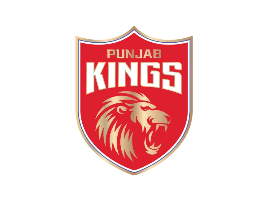
The Punjab Kings logo features a shield design, which is widely used in sports branding to represent power, pride, and tradition
The PBKS logo is designed with a red, gold, and white color scheme, which reflects royalty, passion, and determination
The text "Punjab Kings" is displayed in bold, uppercase, geometric typography, enhancing visibility and impact
A golden roaring lion is the central element of the Punjab Kings logo, representing
The lion’s mane and fierce expression add an extra layer of intensity, making the logo visually striking
Previously known as Kings XI Punjab, the team had a different logo with two roaring lions and a shield However, after rebranding in 2021, the logo was redesigned with a more refined and powerful identity


User reviews