
Indian Premier League Logo
Information
Description
The Indian Premier League (IPL) is a professional Twenty20 cricket league in India, established in 2008 by the Board of Control for Cricket in India (BCCI) It has grown to become one of the most lucrative and popular cricket leagues worldwide The tournament follows a franchise-based model, with teams representing different cities in India
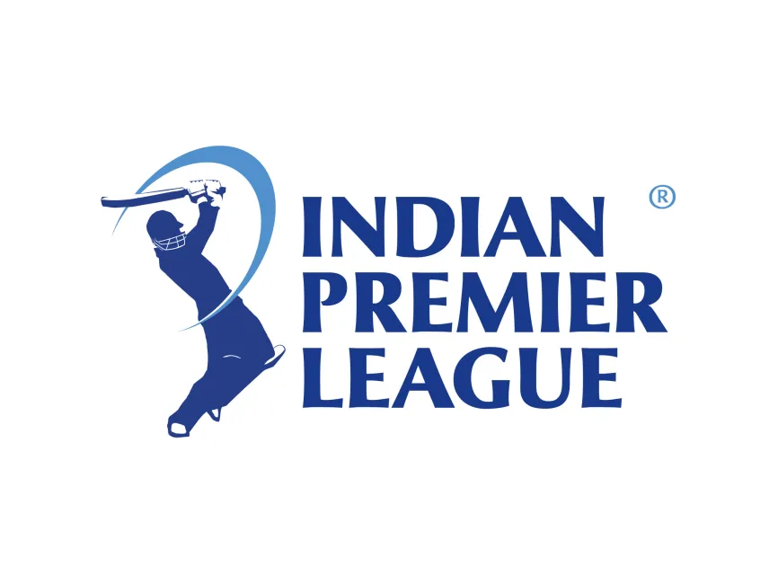
The IPL logo features a silhouette of a batsman in action, dynamically positioned as if hitting a powerful shot The curved stroke behind the player adds a sense of motion, emphasizing the fast-paced and energetic nature of the game
The IPL logo uses shades of blue, which have significant meaning
This blue color scheme aligns with the spirit of cricket, as many teams and cricket-related organizations use similar hues
The text "Indian Premier League" is displayed in bold, uppercase letters with a modern serif typeface
Since its inception in 2008, the IPL logo has undergone minor refinements rather than drastic changes The core elements—batsman silhouette, curved stroke, and bold typography—have remained consistent, reinforcing strong brand identity
The IPL logo successfully represents the spirit of cricket, competition, and entertainment It is instantly recognizable among cricket fans worldwide and is frequently seen on
The use of a simple yet powerful design makes the IPL logo highly versatile and impactful

User reviews