
Ninja Mart Logo
Information
Description
Free download Ninja Mart Logo in SVG, AI, PDF vector formats and transparent PNG
NinjaMart is a logistics and supply chain company specializing in fresh food distribution The company operates as a B2B platform that connects farmers and food suppliers with retailers, restaurants, and other businesses With a focus on efficiency and reliability, NinjaMart aims to streamline the supply chain process, reducing costs and ensuring the timely delivery of fresh produce
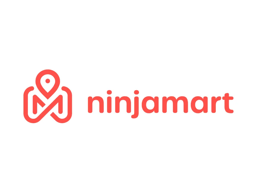
The NinjaMart logo features a combination of a location pin and a stylized "M," symbolizing logistics, movement, and connectivity The location pin represents precise delivery and efficiency, reinforcing the company's commitment to timely and accurate distribution The rounded edges and smooth lines give the logo a modern, friendly, and approachable feel
The wordmark "ninjamart" is in a lowercase, rounded sans-serif font This choice enhances readability while maintaining a casual and innovative look The lowercase style conveys accessibility, making the brand feel more approachable and customer-friendly
The logo is designed in a bright red-orange color, which signifies energy, passion, and reliability Red is often associated with urgency and speed, reinforcing the company's fast and efficient logistics services Additionally, the bold color choice makes the logo highly visible and memorable
The NinjaMart logo is a combination mark, meaning it incorporates both a symbol (the location pin and "M" design) and a wordmark ("ninjamart") This type of logo provides flexibility in branding, allowing the company to use the icon separately for app icons, packaging, or other marketing materials
There is no publicly available information on a major redesign of the NinjaMart logo The current design effectively communicates the brand's core values of efficiency, reliability, and modern logistics solutions
The NinjaMart logo is a well-designed visual identity that aligns with the company's mission Its combination of a location pin, bold typography, and energetic color makes it a strong representation of the brand The logo is modern, functional, and optimized for digital and physical branding

User reviews