
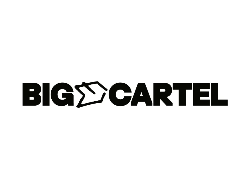
Big Cartel Logo
Information
Description
Big Cartel is an e-commerce platform founded in 2005 by Matt Wigham, designed specifically for independent artists, makers, and creatives to sell their work online Headquartered in Salt Lake City, Utah, Big Cartel has become a well-known alternative to larger e-commerce platforms like Shopify by focusing on simplicity, affordability, and artistic freedom
The platform is known for its DIY ethos, offering easy-to-use tools for small-scale entrepreneurs, musicians, designers, and visual artists to set up online stores without needing advanced technical skills Big Cartel is often praised for its ad-free experience, no listing fees, and customizable themes, all of which support its mission to empower the independent creative economy
Over the years, Big Cartel has maintained a raw, rebellious aesthetic, appealing to its core audience of nonconformist creators and underground artists The new logo is a refined expression of that original identity—balancing bold, structured typography with a rough, hand-drawn graphic element that emphasizes its commitment to authenticity and individuality
This evolution shows a shift toward brand maturity while preserving its roots in creative independence and alternative culture
The new Big Cartel logo is a combination wordmark It features the brand name in all caps, separated by a stylized hand-drawn house or storefront icon between the words “BIG” and “CARTEL” The entire logo is rendered in a solid black color, providing high contrast and a bold visual impact
This structure creates immediate visual hierarchy and readability while placing emphasis on the brand’s core function: providing a "home" or platform for creatives to sell their goods
At the heart of the logo is a unique sketch-style house shape, which replaces the letter “O” or acts as a linking graphic between the two words The hand-drawn quality of the shape reflects
A literal “storefront” or “cartel” headquarters


User reviews