
Express de Lider Logo
Information
Description
Express de Lider is a supermarket chain operating under the larger umbrella of Lider, one of the leading retail brands in Chile Lider itself is owned by Walmart Inc., which entered the Chilean market in 2009 through the acquisition of Distribución y Servicio D&S S.A., the parent company of Lider Express de Lider is a more compact version of the traditional Lider hypermarkets, strategically positioned in urban areas to cater to consumers seeking quick and convenient shopping experiences
The Express de Lider stores aim to combine the accessibility and pricing strategy of Walmart with local consumer needs, offering a variety of groceries and daily-use items with an emphasis on affordability and efficiency
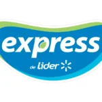
The Express de Lider logo has evolved subtly over the years, maintaining a modern and friendly aesthetic while aligning more closely with Walmart’s global branding elements The most notable change came with the integration of the Walmart spark icon, symbolizing innovation, energy, and the brand’s commitment to delivering quality services to its customers
The logo of Express de Lider is a strong example of effective visual communication in the retail industry It is a combination mark – a logo type that blends both text and a symbolic element to establish brand identity
The shape of the logo is an organic, almost kidney-shaped badge, which provides a unique and friendly look, distinguishing it from traditional rectangular supermarket signs This soft form implies approachability and ease of access – critical for a convenience-focused retail brand
The primary blue background is associated with trust, reliability, and professionalism, which reflects Walmart’s core values The light green accent, most prominently seen in the stylized leaf inside the letter “p”, symbolizes freshness, nature, and sustainability – key concepts in food retail
The white text enhances readability and conveys cleanliness and simplicity, reinforcing the notion of an easy and fast shopping experience
The typography is bold and modern, with a sans-serif typeface that communicates clarity and efficiency The lowercase presentation of the word "express" adds a casual and welcoming tone The green leaf integrated into the “p” adds a playful, eco-conscious element
User reviews