
Buse Terim Logo
Information
Description
Buseterim is a prominent Turkish digital media platform founded by Buse Terim, daughter of the iconic football manager Fatih Terim Originally launched as a personal blog, it has since evolved into a comprehensive lifestyle and fashion portal The platform covers a range of topics such as fashion, beauty, wellness, parenting, and culture, tailored for a modern female audience in Turkey
The transformation of Buseterim from a personal blog to a professional digital magazine represents Buse Terim's personal brand journey, blending celebrity influence with content creation to engage a loyal audience
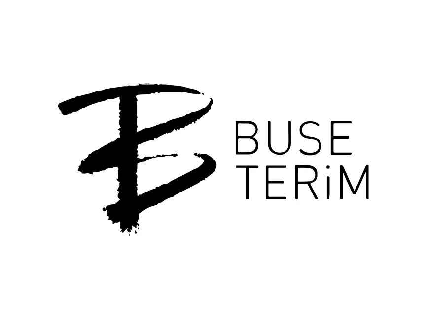
The Buseterim logo has undergone a visual evolution in line with the brand’s maturity Initially, it used more simplistic, personal visuals, reflecting its blog origins The current logo is a polished, modern composition that aligns with lifestyle branding trends and digital magazine aesthetics
The current iteration combines artistic flair with modern typography, representing a balance between individuality and professionalism This evolution reflects the brand’s transition from a personal expression into a recognized digital media entity
The Buseterim logo is a combination mark, featuring both a symbolic icon and a custom wordmark This approach allows the logo to be versatile—recognizable whether used as a full logo or separated into symbol and text for digital applications
The icon on the left side of the logo is a stylized, brushstroke-like monogram that merges the letters B and T, representing Buse Terim This monogram design stands out due to its organic, hand-drawn texture, evoking creativity, personal touch, and artistic flair
The rough, brush-style strokes give the logo a fashion-forward and editorial feel, which aligns with the industry Buseterim operates in The asymmetric, dynamic structure of the monogram suggests movement and modernity
The wordmark uses a clean, minimalist sans-serif font for the text “BUSE TERİM,” arranged in two levels The use of all caps gives the logo a strong and confident appearance, while the slightly altered letterforms (such as the lowercase "i" in “TERiM”) add uniqueness and personality
User reviews