
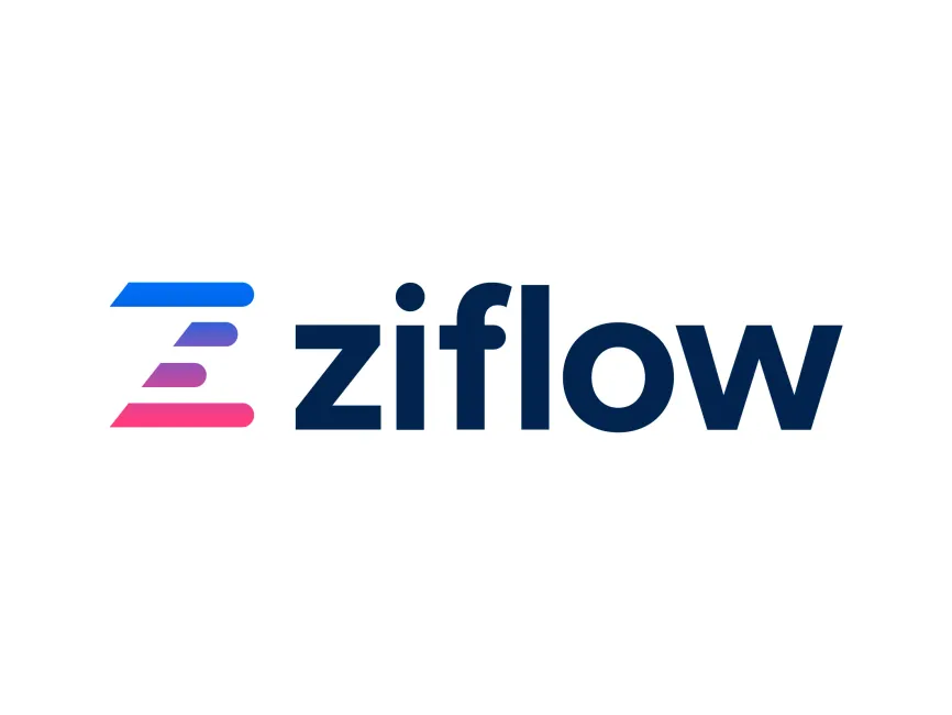
Ziflow Logo
Information
Description
Ziflow is a cloud-based online proofing platform designed to streamline the review and approval process of creative content The company was founded in 2017 by Anthony Welgemoed and Matthias Blume, two veterans in the creative tech industry who previously co-founded ProofHQ (acquired by Workfront and later Adobe) Ziflow was created to fill the need for a more advanced, intuitive, and scalable solution for creative teams to manage feedback and version control on visual content
Ziflow’s platform is widely used by marketing agencies, in-house creative teams, and enterprises that require robust review workflows and collaboration tools It supports all major file types, integrates with numerous third-party applications like Adobe Creative Cloud, and helps eliminate bottlenecks in the content lifecycle
Since its inception, Ziflow has maintained a sleek and modern visual identity that resonates with digital-first audiences The current logo reflects the brand’s evolution toward a more vibrant and recognizable identity, emphasizing speed, creativity, and digital agility
The logo has not undergone drastic redesigns but has been refined to enhance clarity and impact across digital environments The clean sans-serif typography and the unique, colorful icon make it versatile and memorable, supporting the brand's mission to simplify creative collaboration
The icon positioned to the left of the logotype resembles the letter "Z", stylized with three parallel lines that form a horizontal gradient This design choice is not just a letter abstraction but also a visual metaphor for workflow stages, progression, and smooth transitions, aligning with Ziflow’s core functionality in managing and streamlining creative processes
The lines are rounded at the edges, giving the icon a soft, modern, and friendly feel The gradient — moving from blue to purple to pink — suggests creativity, energy, and dynamism, values central to creative professionals and teams who use the platform
The wordmark uses a bold, geometric sans-serif font in a deep navy blue This choice communicates professionalism, reliability, and clarity, which are critical traits for enterprise-grade software The lowercase lettering adds a modern and approachable tone, avoiding the stiffness of all-caps branding and instead inviting user engagement
The standout feature in the typography is the dot of the “i”, which subtly aligns with the round elements of the icon, adding to the logo's visual harmony and brand cohesiveness

User reviews