
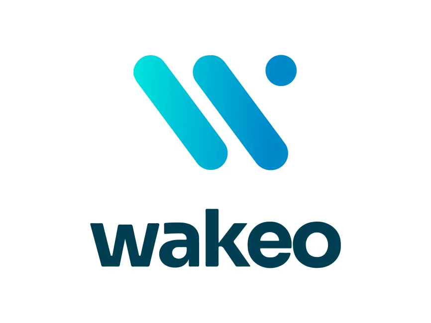
Wakeo Logo
Information
Description
Free download Wakeo Logo in SVG, AI, PDF vector formats and transparent PNG
Wakeo is a France-based SaaS company revolutionizing the world of supply chain visibility through predictive analytics Founded in 2016 by Julien Cote, Thomas Larrieu, and Nicolas Derouault, Wakeo provides real-time tracking solutions for multimodal shipments—air, sea, and road Its platform leverages machine learning and data aggregation to provide predictive ETAs, delay alerts, and actionable insights, helping enterprises optimize logistics operations and enhance customer satisfaction
Wakeo collaborates with global freight forwarders, shippers, and third-party logistics providers, empowering them with transparency and control over global transport flows Its services are used in industries like manufacturing, retail, aerospace, and pharmaceuticals
The Wakeo logo reflects the company’s tech-driven, forward-thinking identity While the brand has maintained a consistent visual language since its inception, the current logo represents a more refined and modern evolution that aligns with its status as a trusted logistics technology partner It combines a sleek icon with a bold wordmark, offering both memorability and versatility
The Wakeo logo is a combination mark, consisting of a distinctive icon above a bold, lowercase wordmark This format allows for flexible branding across multiple media—whether in full format or as a stand-alone icon for mobile apps, social media, or dashboards
The icon resembles a stylized "W", crafted with two diagonal pill-shaped bars and a circular dot, which adds dynamism and uniqueness Visually, it echoes themes of motion, tracking, and coordination, key elements in logistics The gradient applied to the bars—from cyan to a deeper blue—suggests data flow, connectivity, and progress
The dot may also imply real-time pinpointing or a geolocation marker, aligning with the brand’s value proposition around shipment tracking and predictive visibility
The wordmark features a clean, rounded sans-serif typeface in all lowercase This design choice gives the brand a modern, accessible, and tech-friendly feel The letterforms are thick and uniform, contributing to strong legibility at all sizes—an important consideration for SaaS platforms
The rounded shapes convey friendliness and reliability, while the absence of any sharp angles suggests seamless operations—exactly what logistics and supply chain clients are seeking
User reviews