
Uniqode Logo
Information
Description
UNIQODE, formerly known as Beaconstac, is a technology company specializing in QR code solutions for businesses of all sizes The company was founded in 2012 and is headquartered in New York, with additional presence in Bangalore, India It provides enterprise-grade QR code tools that allow organizations to create dynamic, trackable, and secure QR codes UNIQODE supports a wide range of use cases, including marketing, contactless experiences, and digital business cards
The company underwent a rebranding in 2023, changing its name from Beaconstac to UNIQODE to better reflect its unique approach to creating customizable and secure QR code experiences This rebranding aimed to move the brand identity toward a more modern, tech-forward positioning
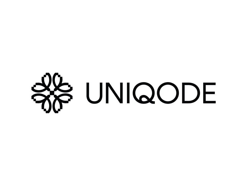
The UNIQODE logo combines a wordmark and a symbolic icon, which makes it a combination logo This structure is often chosen by companies that want to emphasize both brand name recognition and visual symbolism
The icon on the left side of the logo resembles a symmetrical, floral or geometric pattern On closer inspection, it can be interpreted as four stylized "Q" letters arranged in a circular symmetry This is a clever visual reference to the brand's core product — QR codes — while also reinforcing the unique character of the letter "Q" in the brand name
The typography used in "UNIQODE" is modern and sans-serif, suggesting clarity, innovation, and professionalism Notably, the letter "Q" in the wordmark features a unique design where its tail overlaps slightly with the "O", adding a sense of fluidity and interconnection This custom typographic touch subtly reinforces the brand’s identity and its focus on connectivity through technology
The logo is rendered in black and white, a color choice that conveys sophistication, timelessness, and neutrality This minimalist color palette is ideal for a tech company that wants to appear clean, reliable, and adaptable across a wide variety of use cases and industries
The symbol evokes balance, precision, and structure — all qualities that align with the brand’s mission to create reliable, scalable QR code platforms The symmetrical pattern also gives a hint of complexity and intelligence, which ties back to the software’s high-tech nature and enterprise focus
There is an aesthetic harmony between the icon and the text, giving the logo a cohesive and high-end feel It works well both on digital interfaces and in print formats, retaining clarity even at smaller sizes — an essential trait for modern brand identities
User reviews