
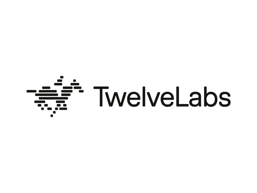
TwelveLabs Logo
Information
Description
Twelve Labs is an AI startup revolutionizing the way machines understand videos Founded in 2021, the company has rapidly gained attention for its cutting-edge video search and understanding technology Headquartered in San Francisco, Twelve Labs was co-founded by Jae Lee, who serves as CEO The company focuses on enabling developers to build applications that can search, understand, and interpret video content in a way that closely mimics human perception Their mission is to bridge the gap between human understanding and machine interpretation of visual data
Twelve Labs has maintained a modern and minimalistic brand image since its inception The current logo reflects the company’s core values—innovation, intelligence, and clarity While the brand is still young, it has shown a strong commitment to clean, futuristic design that aligns with its AI-driven technology focus
The Twelve Labs logo consists of two key elements: a unique symbol and a sleek wordmark
The symbol to the left of the wordmark is composed of horizontal lines and small rectangular blocks At first glance, it resembles a bird in flight or an abstract shape symbolizing motion or data streams This design reflects the dynamic nature of video content and its segmentation—core to the company’s technology The use of varying bar lengths may suggest the layered complexity of data or timelines in a video, hinting at the temporal and visual indexing capabilities of Twelve Labs’ platform
The arrangement of lines and dots is reminiscent of digital waveform representations or pixel-level data mapping, reinforcing the company's tech-forward identity
The wordmark "TwelveLabs" uses a rounded, sans-serif font that conveys modernity, simplicity, and friendliness The capital “T” and “L” maintain readability and create balance, while the rounded edges give it a human touch, reflecting the brand’s goal to make AI more accessible and intuitive
The logo uses a monochromatic black design on a white background This black-and-white palette is a classic choice in tech branding, representing sophistication, reliability, and clarity It ensures versatility across both digital and print media
This is a combination mark—featuring both a pictorial icon and a typographic brand name The logo can be used either as a complete lockup or with the icon standalone in more compact use cases, such as app icons or social media profiles This type of logo ensures adaptability and strong brand recognition

User reviews