
TrustRadius Logo
Information
Description
TrustRadius is a trusted B2B software review platform that helps buyers make better product decisions based on verified user feedback The company was founded in 2012 by Vinay Bhagat and is headquartered in Austin, Texas TrustRadius aims to bring transparency and trust to the software selection process by offering in-depth, authenticated reviews that go beyond surface-level ratings Over the years, it has grown into one of the most influential platforms for enterprise software reviews and comparisons, trusted by millions of professionals globally
Since its inception in 2012, TrustRadius has maintained a focus on professionalism and credibility in its visual identity Earlier versions of the logo leaned toward simple typography and conventional layout However, as the company matured and its product offering evolved, the logo underwent a modernization to better reflect innovation, trust, and digital credibility The current logo presents a bold and contemporary brand image, with a stylized emblem and updated wordmark
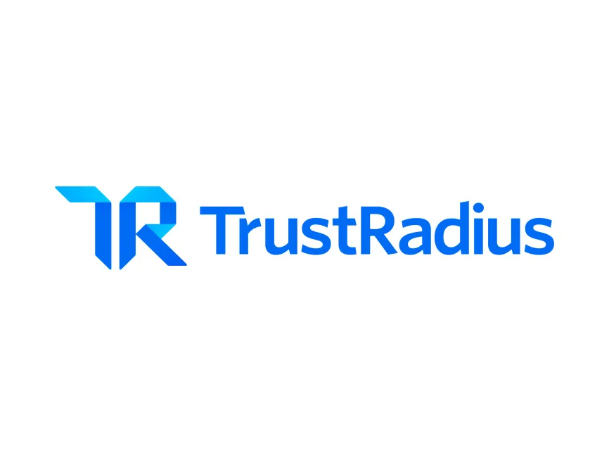
The TrustRadius logo features a modern and geometric design that aligns perfectly with the company’s mission of providing structured and reliable insights for software buyers
The logo uses a combination mark that includes a stylized monogram of the initials "T" and "R" to the left of the company name The letters are fused in a dynamic, angular form, creating a visually engaging and futuristic design The sharp, clean edges of the symbol suggest precision and professionalism, aligning with the company’s data-driven approach
The geometric abstraction not only adds a tech-forward identity to the brand but also conveys motion and progressiveness — qualities that appeal to a tech-savvy B2B audience
The logotype uses a clean, modern sans-serif font that is easy to read and professional The font has slightly rounded edges, which humanizes the brand and balances the angular form of the symbol The use of capital and lowercase letters gives the logo an approachable yet authoritative feel
The logo prominently features shades of blue, a color traditionally associated with trust, technology, and intelligence The gradient used in the monogram transitions from light blue to a deeper blue, adding depth and movement to the logo This gradient effect enhances the modern appeal and makes the emblem visually memorable
Blue is a strategic choice for a brand like TrustRadius, as it communicates reliability, security, and corporate professionalism — all essential values for a review platform where trust is central

User reviews