
Toku Logo
Information
Description
Toku is a Singapore-based technology company specializing in cloud communications, with a strong focus on providing communication solutions tailored for enterprises in the Asia-Pacific region The company was founded in 2018 by Thomas Laboulle, and it has quickly positioned itself as a key player in the field of customer engagement through Voice, SMS, and WhatsApp APIs, as well as call center and unified communication solutions
Toku’s mission is to simplify business communications and help organizations enhance customer experiences across multiple channels As of recent years, the company has expanded its presence beyond Singapore, aiming to serve businesses throughout Southeast Asia with scalable and secure cloud communication platforms
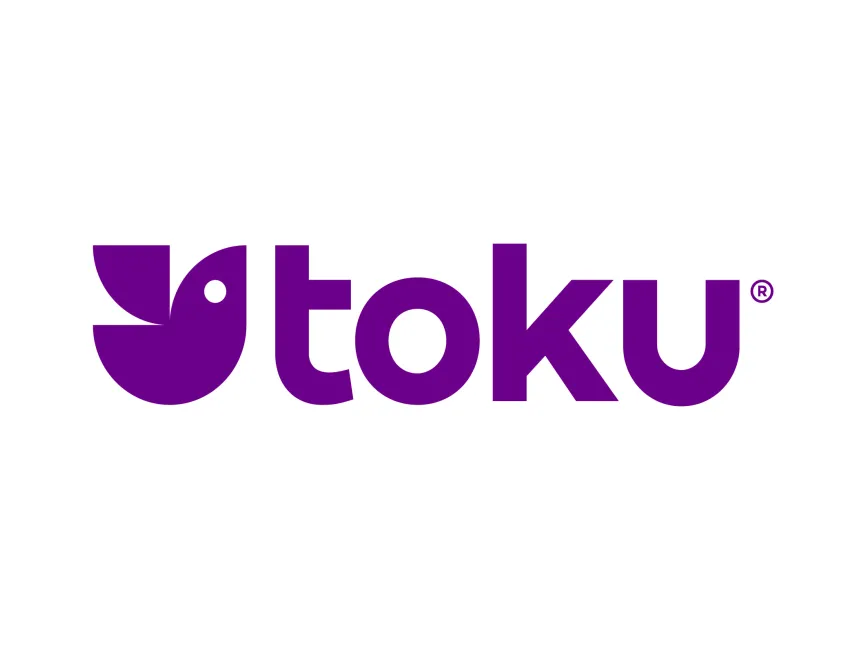
The Toku logo is a well-crafted and visually striking example of modern corporate identity It combines simplicity, symbolism, and a distinctive color choice to communicate the brand’s values and market positioning effectively
The Toku logo is a combination mark, integrating a unique abstract symbol with clean, bold typography This format allows the logo to be versatile and instantly recognizable, whether used in full or with just the symbol
The most distinctive part of the Toku logo is the bird-like abstract symbol on the left This shape resembles a stylized bird formed by geometric curves and negative space, suggesting themes of communication, freedom, and agility — all core attributes for a cloud communication provider
The shape uses a half-circle base and a leaf-like top extension, forming a minimalist bird motif
A white circle within the larger shape acts as the bird’s eye, enhancing the recognizable silhouette
This clever use of geometry and negative space adds a friendly, approachable character to the logo while maintaining a professional tone







User reviews