
The Hartford Logo
Information
Description
The Hartford Financial Services Group, Inc., known simply as The Hartford, is a leading U.S.-based investment and insurance company founded in 1810 With its headquarters in Hartford, Connecticut, the company has a long-standing reputation for stability, integrity, and customer-centric service It was originally formed as a fire insurance company and has grown over more than two centuries into a diversified financial services firm offering property and casualty insurance, group benefits, and mutual funds
The company played a significant historical role by insuring Abraham Lincoln’s Illinois home and even sponsoring Babe Ruth's policy Its heritage and values are deeply rooted in trust, resilience, and American tradition
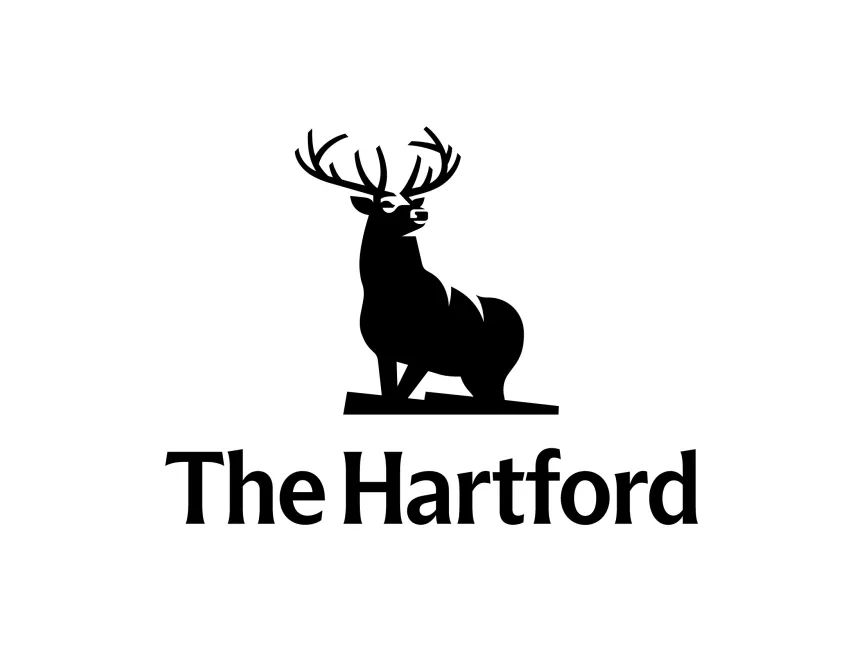
The Hartford's logo is one of the most recognizable and respected symbols in the American financial sector The image of a powerful stag (deer) is derived from the painting “The Monarch of the Glen” by Sir Edwin Landseer, which was first used by the company in the 19th century Over time, the logo has gone through refinements for clarity and modern aesthetics, but its core symbolism has remained intact
The use of the stag represents strength, dignity, and longevity—qualities that reflect the company’s mission and enduring presence in the market
The Hartford logo is a combination mark, featuring both a wordmark and a powerful symbolic illustration The stag stands upright and confident, with a proud posture and elaborate antlers, projecting a sense of nobility and guardianship The animal is placed on a solid base, reinforcing a foundation of stability
The clean, stylized silhouette of the deer keeps the image simple and elegant while preserving the classical inspiration It evokes tradition, heritage, and protection—all essential values in the insurance and financial services sector
The typeface used in “The Hartford” wordmark is a serif font, which conveys tradition, trust, and professionalism Serif fonts are often associated with institutions that want to emphasize their credibility and history The spacing and weight of the text are well-balanced, giving it a sophisticated and formal tone
The capitalized "The" and "Hartford" reflect proper noun usage and reinforce the company's authority as a long-established brand
User reviews