
Shiji Group Logo
Information
Description
Shiji Group is a global provider of technology solutions for the hospitality, food service, retail, and entertainment industries Founded in 1998 in China, Shiji began as a hotel IT solutions company and has since evolved into a multinational technology powerhouse, offering a broad portfolio of products that include property management systems (PMS), point-of-sale (POS) systems, payment platforms, guest experience tools, and enterprise data management solutions
Today, Shiji serves more than 91,000 hotels, 200,000 restaurants, and 600,000 retail outlets globally The company has grown through strategic partnerships and acquisitions, including investments in companies such as Infrasys, Concept, ReviewPro, MyCheck, SnapShot, and IcePortal, further enhancing its reach and product capabilities
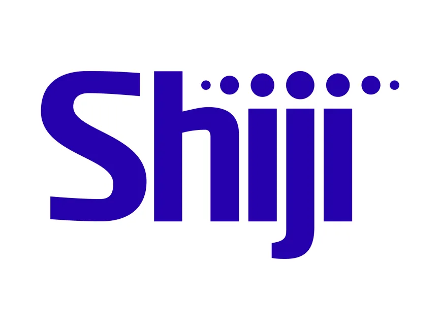
The Shiji logo has undergone several design updates over the years, each iteration signaling the company’s shift from a regional software provider to a global tech innovator The current logo is a modern and abstract representation that highlights the brand’s international outlook and digital-first philosophy
The Shiji logo uses a custom sans-serif typeface with unique curves and geometric shapes The most visually striking element is the bold and thick letterforms, which create a sense of stability and confidence The "S" is particularly stylized, with soft curves that balance the otherwise rigid and vertical structure of the other letters
The brand name is written in all lowercase, which gives a modern, approachable, and technology-driven feel, contrasting with traditional uppercase corporate logos that can feel rigid or outdated
One of the most distinctive design features of the logo is the series of circular dots above the "i" characters There are six dots in total, increasing in size towards the center and then decreasing again—visually suggesting a ripple effect or digital signal transmission This not only represents connectivity and data flow but also creates a visual rhythm, reinforcing Shiji’s role in unifying systems across the hospitality ecosystem
These dots could also be interpreted as people or nodes in a network, symbolizing Shiji's emphasis on collaboration, integration, and digital interaction
Deep Blue (#2301d4 approx.): The primary color used in the logo signifies trust, technology, innovation, and intelligence Blue is commonly used in tech and enterprise branding for its professional and calming associations





User reviews