
Saronic Ferries Logo
Information
Description
Saronic Ferries is a Greek maritime transportation company that provides passenger and vehicle ferry services between Athens (Piraeus port) and the Saronic Gulf islands, including Aegina, Agistri, Poros, Hydra, and Spetses The company plays a vital role in regional mobility by offering reliable, daily ferry routes that connect the mainland with popular island destinations
Saronic Ferries is known for its commitment to safe, environmentally conscious, and accessible travel, and it serves both tourists and local residents year-round With a modernized fleet and digital booking systems, the company is a key player in Greece’s short-distance maritime travel sector
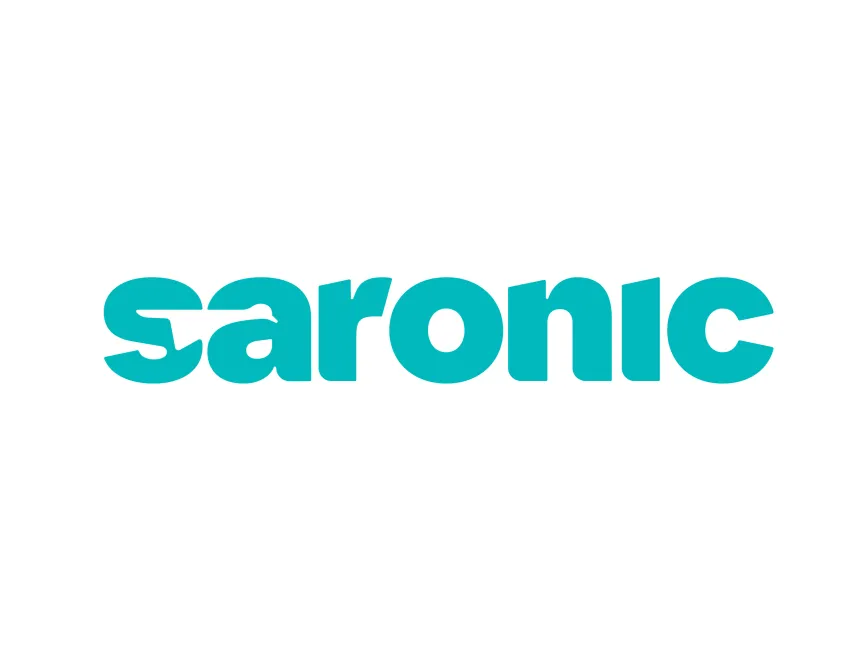
The new Saronic Ferries logo represents a modernization of the brand that aligns with the company’s mission to deliver a better, greener, and more seamless travel experience Compared to previous iterations that may have featured traditional nautical symbols or classic serif typography, this updated version embraces simplicity and personality, signaling a shift toward a more design-conscious and user-friendly identity
The updated logo reflects a fresh, contemporary brand that resonates with today's travelers—especially digital-native tourists looking for trustworthy yet aesthetically pleasing transport services
The logo is a wordmark, consisting solely of the word "saronic" in lowercase, bold rounded typography, using a vibrant turquoise or aqua blue color The design exudes modernity and friendliness—ideal for a hospitality-adjacent brand like a ferry company
It is clean, scalable, and designed with strong visual simplicity, making it ideal for both digital (apps, websites, tickets) and physical branding (ship signage, uniforms, boarding terminals)
The standout design feature is in the letter "s", where a white silhouette of a ferry or ship is carved through the middle This negative space effect is clever and functional—it subtly communicates the core of the company’s business (ferry transport) within the first character
This ship shape is streamlined and elegant, possibly resembling a vessel gliding through water, and it provides a visual cue for motion, speed, and direction




User reviews