
Mattressman Logo
Information
Description
Mattressman is one of the UK’s leading mattress and bedding retailers, established in 2004 The company began as an online-only business and rapidly expanded its operations with physical stores across the UK Its headquarters is located in Norwich, Norfolk Mattressman has grown significantly by offering a wide range of mattresses, beds, bedroom furniture, and bedding accessories from top manufacturers at competitive prices
Over the years, the company has developed a reputation for excellent customer service, fast delivery, and a strong online presence It partners with well-known brands like Silentnight, Sealy, Hypnos, and others, providing customers with a trusted shopping experience
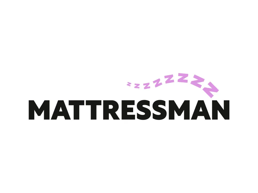
While there haven’t been many drastic redesigns in the Mattressman logo history, the brand has subtly refined its visual identity to reflect modern aesthetics and digital compatibility The current logo emphasizes simplicity, legibility, and relevance to its industry The use of the purple “Z”s is a newer touch that reinforces the brand’s association with sleep
The logo uses a bold, sans-serif typeface for the word “MATTRESSMAN” This choice communicates reliability, stability, and modernity The all-uppercase lettering adds to the brand’s strong, confident presence while maintaining a clean and minimalistic look
The primary color in the text is solid black, which conveys professionalism and seriousness In contrast, the soft lavender or light purple “Z” shapes introduce a calming, sleep-related element Purple is often associated with relaxation, dreams, and comfort, making it a strategic choice for a mattress brand
Above the wordmark, a flowing trail of increasing-size “Z” letters is positioned in a gentle arc This is a direct and clever reference to sleep, commonly symbolized by “Zzz” in pop culture The curvature of the Zs mimics the contour of a person lying on a mattress or the curve of a comfortable spine, subtly tying in with the ergonomic benefits of a good mattress
The Mattressman logo is a combination mark, incorporating both text and graphic elements in a unified design It is modern, versatile, and easily scalable, making it suitable for both digital and print formats The simplicity of the design ensures high legibility at smaller sizes, an essential aspect for e-commerce and mobile interfaces
The Mattressman logo is a prime example of effective branding in the sleep industry It combines bold typography with playful yet meaningful visuals to instantly convey the brand’s core service — helping people get better sleep The use of purple “Z”s adds personality while maintaining a professional tone



User reviews