

Little Dish Logo
Information
Description
Little Dish is a UK-based food company specializing in nutritious, ready-to-eat meals designed specifically for toddlers and young children The company was founded in 2006 by Hillary Graves, a mother who saw the need for healthy, convenient meals made from 100% natural ingredients, without additives or preservatives Little Dish has grown to become a trusted brand among parents, offering a range of fresh meals inspired by home cooking
The mission of Little Dish is simple and clear: to make it easy for parents to give their children nutritious food they’ll enjoy Over the years, the brand has received multiple awards for innovation, product quality, and its contribution to children’s nutrition
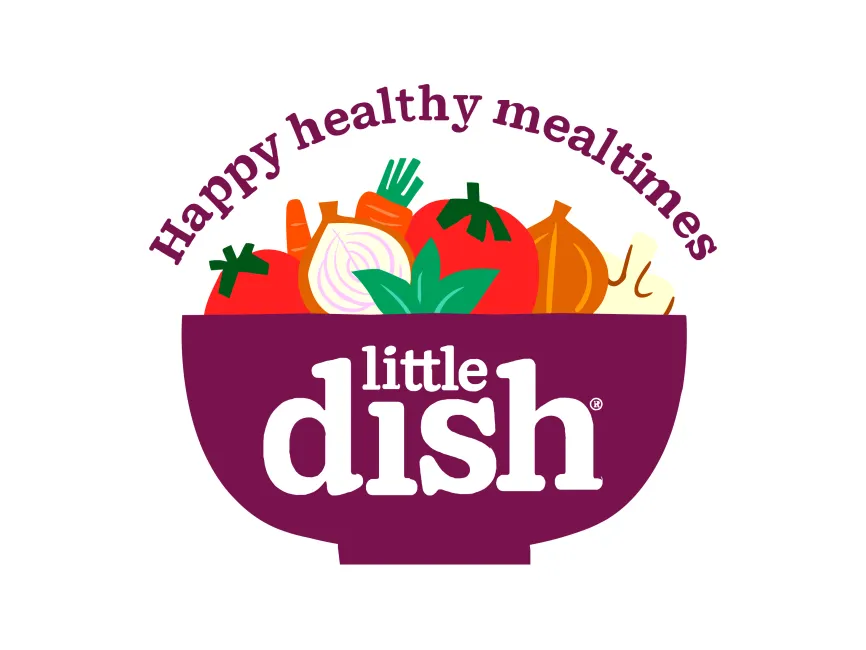
The Little Dish logo has undergone minor refinements over the years, but the core elements have remained consistent Earlier versions emphasized a more playful, hand-drawn style In its current version, the logo has been modernized with cleaner lines and stronger color contrast, reflecting the brand’s maturity while still appealing to a family-oriented audience
This rebranding move has helped Little Dish strengthen its visual identity and stand out on supermarket shelves, maintaining a balance between professionalism and warmth
The Little Dish logo is a great example of a combination mark, integrating both text and illustrative elements in a cohesive and visually appealing manner Here's a breakdown of the design elements
The central element is a deep purple bowl, symbolizing nourishment and home-cooked meals From this bowl, various colorful vegetables emerge – tomatoes, carrots, onions, and greens – instantly communicating freshness, health, and natural ingredients The vegetables are rendered in a flat, illustrative style that feels friendly and non-corporate, appealing directly to parents and children alike
The text “little dish” is embedded within the bowl, with “little” in lowercase above “dish.” The word “dish” is bold, rounded, and soft-edged, which enhances readability and reinforces a sense of safety and comfort This typographic style mimics children's storybook fonts, which subconsciously aligns the brand with trust and familiarity
The dominant purple color of the bowl conveys richness and creativity, while also offering strong contrast with the white font The vegetables are brightly colored in natural hues—reds, oranges, greens—symbolizing vitality, energy, and health




User reviews