
Jacopsen Bryggeri Logo
Information
Description
Jacobsen Bryggeri is a Danish brewery known for its high-quality craft beers, established as a premium sub-brand of Carlsberg The brand is named after J.C Jacobsen, the founder of Carlsberg, and it embraces the rich brewing heritage of Denmark The brewery is part of the Carlsberg Group and focuses on traditional yet innovative beer styles, blending classic brewing techniques with modern craftsmanship
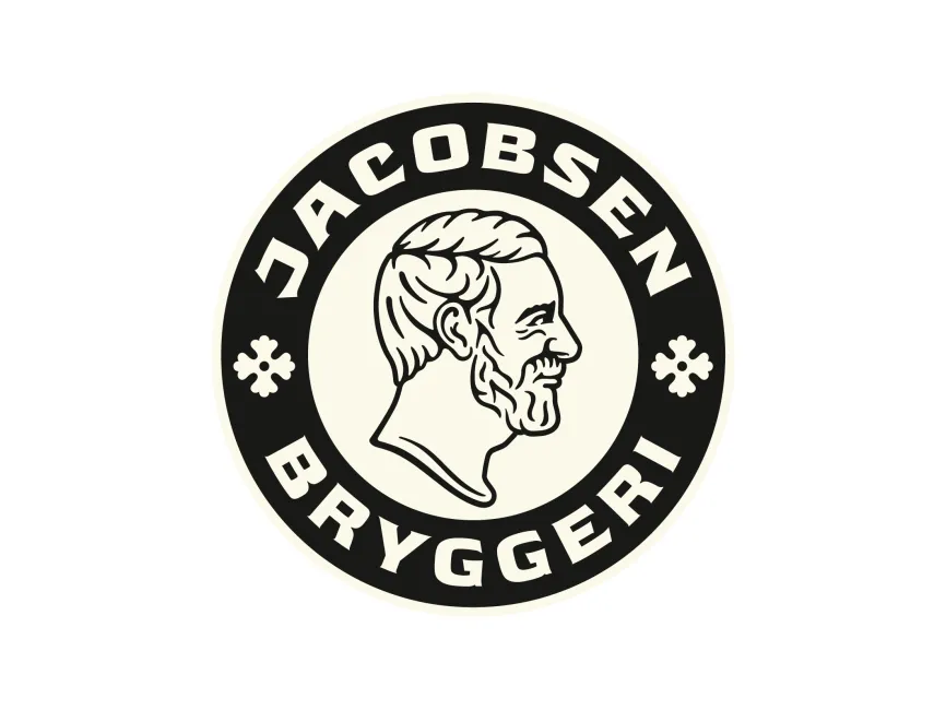
The Jacobsen Bryggeri logo features a circular emblem, a common style among traditional breweries This circular design conveys a sense of heritage, unity, and authenticity Within the emblem, a detailed line-art portrait of J.C Jacobsen is prominently displayed, reinforcing the brand's historical roots
The logo employs bold, uppercase sans-serif typography for "JACOBSEN BRYGGERI." The slightly curved arrangement of the text follows the circular shape, enhancing balance and readability The font choice evokes a vintage and classic feel, aligning with the brand's historical significance
The logo primarily uses black and an off-white/cream background The black provides a sense of elegance, strength, and tradition, while the off-white gives a slightly aged and vintage appeal This combination enhances the logo’s premium and historic look
Jacobsen Bryggeri has maintained a consistent visual identity, emphasizing tradition and craftsmanship While other Carlsberg-related brands have modernized their logos over time, Jacobsen Bryggeri has retained a more classic and vintage approach to reflect its artisanal beer-making philosophy
Jacobsen Bryggeri’s logo is a well-crafted design that perfectly aligns with its brand identity The use of a circular shape, historical portrait, and vintage typography creates a timeless and sophisticated look It effectively communicates heritage, quality, and tradition—key values for a premium brewery






User reviews