
i-dle Logo
Information
Description
The South Korean girl group formerly known as (G)I-DLE, formed by Cube Entertainment in 2018, has emerged as one of K-pop’s most dynamic and globally recognized acts Originally debuting with six members, the group solidified a distinct identity through self-produced music, bold concepts, and multicultural appeal In 2025, the group initiated a rebranding strategy by dropping the “(G)” and adopting the new stylized name i-dle, marking a significant evolution in their global positioning
This strategic renaming aims to further modernize the group’s identity and increase international resonance, as the original name “(G)I-DLE” was often subject to pronunciation confusion The new name, i-dle, maintains continuity while emphasizing individuality ("I") and creativity, aligned with their artistic independence and diverse musical expression
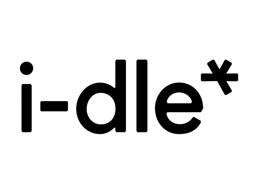
The new i-dle logo employs a bold, clean sans-serif typeface with uniform stroke width, reflecting modernity and clarity The lowercase styling suggests approachability, humility, and artistic subtlety, deviating from the often flashy logos in the K-pop industry The minimalism supports the group’s maturity and confidence in their established brand
The most striking element of the logo is the asterisk (*) at the end In design language, an asterisk often denotes additional information, complexity, or uniqueness Positioned asymmetrically above the final "e", it introduces a dynamic, almost star-like energy that breaks the rigid linearity of the text Symbolically, it can represent the group’s "X-factor", hidden talents, or multifaceted personas It also invites interpretation, adding an intellectual and artistic edge to the otherwise minimal design
The current version appears in black and white, reinforcing the brand’s evolution toward elegance, maturity, and timelessness Black signifies authority, strength, and confidence, while white adds balance and purity This neutral palette makes the logo versatile for use across album covers, merchandise, social media, and global marketing campaigns
This is a wordmark logo—a type of logo built purely on typography with a symbolic accent (asterisk) Wordmarks are particularly effective in music branding where name recognition is paramount The absence of ornate elements keeps the focus on the name itself, reinforcing brand retention
The rebranding from (G)I-DLE to i-dle is not just a stylistic change but a calculated move toward global simplicity and marketability The new name and logo reduce linguistic barriers and create a sleek, internationally friendly identity It signals a new chapter for the group—potentially hinting at an era of musical reinvention or expanded global activities
This transition may also indicate a shift in creative direction, allowing the group to grow beyond their original K-pop framework and explore new genres, visuals, and storytelling The branding suggests a blend of confidence and minimalism, embodying the phrase "less is more."

User reviews