
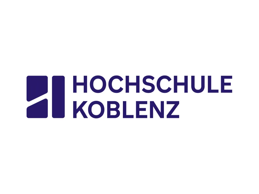
Hochschule Koblenz Logo
Information
Description
Hochschule Koblenz – University of Applied Sciences Koblenz is one of Germany’s recognized universities for applied sciences, located in Rhineland-Palatinate Founded in 1971, the institution has grown into a multi-campus university with locations in Koblenz (RheinMoselCampus), Remagen (RheinAhrCampus), and Höhr-Grenzhausen (WesterWaldCampus) It offers a wide range of study programs in engineering, business, social sciences, arts, and design, emphasizing practical orientation and strong ties to industry and research
With more than 9,000 students, Hochschule Koblenz is known for its modern teaching methods, applied research, and international cooperation, attracting both local and global students
The new logo of Hochschule Koblenz represents a fresh and modernized visual identity The earlier visual identity of many German applied sciences universities often featured traditional crests, abstract academic symbols, or conservative typography The new design takes a minimalist, geometric, and contemporary approach, reflecting the university’s forward-looking philosophy and its role in innovation, applied sciences, and international collaboration
The logo now aligns with the branding standards of modern European universities that want to be perceived as global, digital-ready, and student-oriented
The Hochschule Koblenz logo is a combination mark, consisting of both a symbol and a wordmark
Typography:The text “HOCHSCHULE KOBLENZ” is written in bold, sans-serif, uppercase letters, projecting clarity, strength, and confidence The geometric typeface enhances readability and reflects modernity and professionalism
Symbol:The abstract symbol on the left side is built from two vertical rectangles divided by a diagonal line, creating a dynamic and progressive look The design subtly resembles the letter H, standing for “Hochschule.” The diagonal cut adds a sense of movement and growth, symbolizing progress, innovation, and new pathways in education
Color:The logo uses a deep violet/indigo tone, which conveys stability, wisdom, and ambition It is a color often associated with education and knowledge but also with creativity and transformation—fitting for an applied sciences institution that merges tradition with modernity



User reviews