

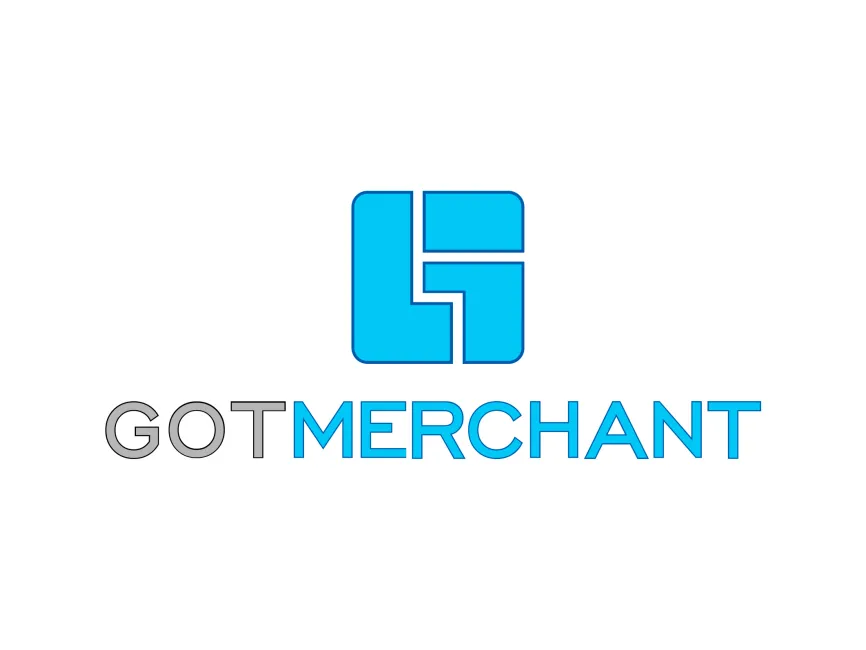
Gotmerchant Logo
Information
Description
Gotmerchant.com is a U.S.-based payment processing company that has been in operation since 1998 The company offers a wide range of merchant services, including credit card processing, point-of-sale (POS) systems, restaurant and retail POS solutions, e-commerce integrations, and virtual terminals Gotmerchant is particularly known for providing tailored solutions to small and medium-sized businesses with transparent pricing and personalized customer support
Headquartered in Texas, Gotmerchant has built its reputation on customer-centric service, competitive rates, and long-term business relationships, making it a trusted name in the payment processing industry for over two decades
The Gotmerchant logo appears modern and tech-forward, aligning with the company’s digital services While there is limited public documentation on major logo redesigns, the current version reflects a clean, bold, and minimalistic identity It represents the evolution of the brand from traditional payment processing toward integrated, digital merchant solutions
There are no signs of legacy serif fonts or outdated graphics, which suggests that the logo has either been updated in recent years or was designed with longevity in mind
The Gotmerchant logo is a combination mark, including a symbolic logomark above the brand name text This format enhances brand recognition and allows for flexible use across digital and print platforms, including mobile apps, websites, and business cards
The logomark is a stylized geometric icon made up of four distinct blue segments that form a square The internal negative space creates an abstract "G" or possibly "GM" depending on interpretation This modular, grid-like construction reflects structure, reliability, and modern technology — core values in the payment and merchant service industry
The use of symmetry and clean edges implies trustworthiness and consistency, vital for a business dealing with financial transactions The icon could also be interpreted as tiles or blocks, symbolizing the foundational support Gotmerchant provides to businesses
The text “GOTMERCHANT” uses a contemporary sans-serif font with a crisp and modern aesthetic The word is split visually into two parts: “GOT” in gray, and “MERCHANT” in bright blue This not only adds visual hierarchy but also reinforces the focus on merchants — the company’s primary audience



User reviews