
Genics Logo
Information
Description
Genics Inc is a North American company specializing in advanced wood protection solutions With decades of expertise in the field, Genics serves various industries including construction, forestry, utility, and marine sectors, offering products that protect wooden infrastructure from decay, insect damage, and environmental degradation
Their tagline—“Wherever Wood Is Used™”—encapsulates their broad market reach and focus Genics is known for developing preservative treatments, inspection tools, and application systems to ensure wood longevity and safety in critical-use environments
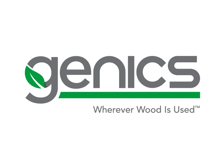
The Genics logo has remained relatively consistent in its visual identity, favoring a clean and environmentally conscious look that aligns with the company's mission to protect natural resources There are no widely documented past versions of the logo, which indicates a stable branding approach focused on recognition and clarity in B2B markets
The Genics logo is a wordmark combined with a symbolic element, making it a modern example of a combination mark The bold, lowercase typeface projects professionalism and accessibility, while the stylized "g" with a leaf instantly communicates the brand’s eco-friendly and natural association
The most distinctive feature in the logo is the leaf integrated into the letter "g", suggesting sustainability, nature, and preservation The leaf design is sleek and modern, positioned to appear as part of the negative space in the rounded form of the letter
Additionally, a horizontal green bar underlines the main logotype, visually anchoring the word “genics” and representing growth, support, and natural foundation—essential themes in a wood-preservation business
The typography is rounded and sans-serif, evoking a sense of precision, safety, and forward-thinking innovation The use of all lowercase letters gives the brand a friendly, approachable, and humanistic feel, which contrasts nicely with the technical nature of the industry
The tagline “Wherever Wood Is Used™” is presented in a lighter, smaller font, balancing the bold logo and clearly stating the brand’s core promise
User reviews