
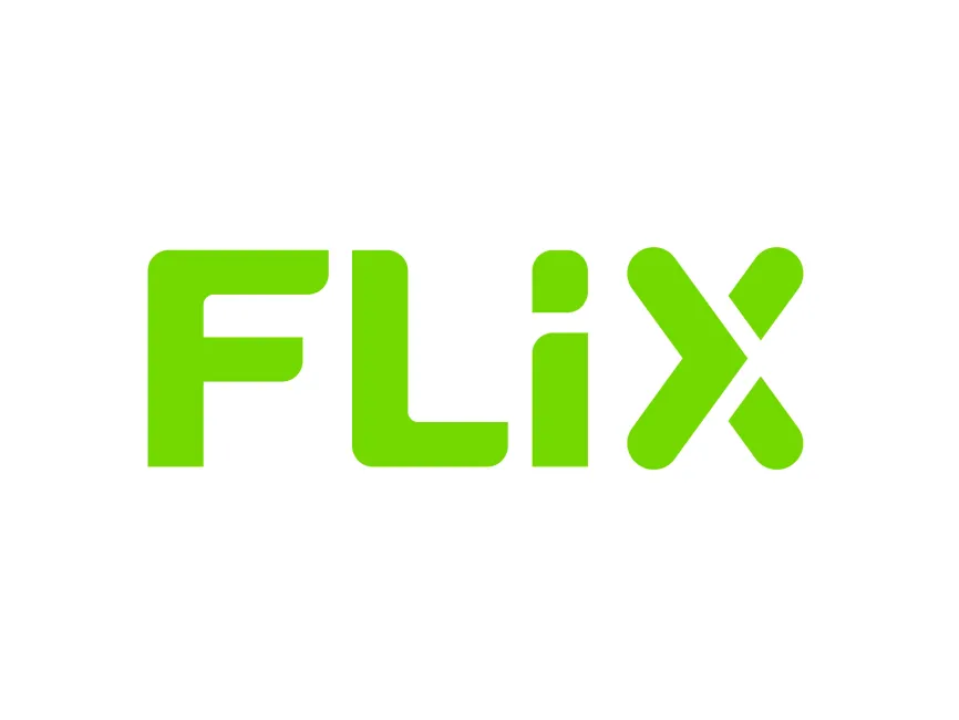
Flix Logo
Information
Description
Flix SE is a German mobility company best known for operating FlixBus, FlixTrain, and FlixCar Founded in 2011 by Jochen Engert, Daniel Krauss, and André Schwämmlein, the company has revolutionized long-distance travel in Europe and beyond by combining technology, affordability, and sustainability The company’s main headquarters is located in Munich, Germany Since its inception, Flix has expanded its operations to include services across Europe, the United States, Brazil, and Canada
The brand is distinguished for offering smart and green mobility solutions, with a heavy emphasis on digitalization Flix's business model combines e-commerce, data-driven decision-making, and partner-operated fleets to maintain cost-effective and eco-friendly travel solutions
Flix has undergone several branding updates to reflect its evolution from a domestic bus operator into a global travel tech company The current logo adopts a modern, minimalistic style that emphasizes digital sophistication and clarity It maintains the core identity through its distinct green color, symbolizing sustainability and eco-conscious transportation
Earlier versions of the logo included more detail, sometimes with additional elements like arrows or vehicle-like illustrations Over time, Flix has moved toward a flatter, more streamlined design in alignment with global branding trends
The logo features a custom sans-serif typeface with bold, rounded corners This design choice gives a sense of friendliness, accessibility, and modernity The typography is geometric, conveying a clean and structured brand image while still appearing approachable and tech-savvy
The letter “X” is particularly striking—constructed with a stylized design that subtly resembles arrows pointing in opposite directions This could symbolize movement, direction, and connectivity, all of which align with Flix’s core mission of enabling travel
Flix's logo is a wordmark, where the entire branding is represented through stylized text without additional icons or graphic elements This type of logo is effective for digital-first companies, ensuring strong brand recall and readability in both small and large formats
All letters in the logo have soft edges and uniform thickness, reflecting safety, comfort, and simplicity The overall visual balance is harmonious, which supports the idea of a smooth, seamless travel experience The minimalist and geometric design also ensures scalability and consistency across apps, buses, trains, and web platforms
User reviews