
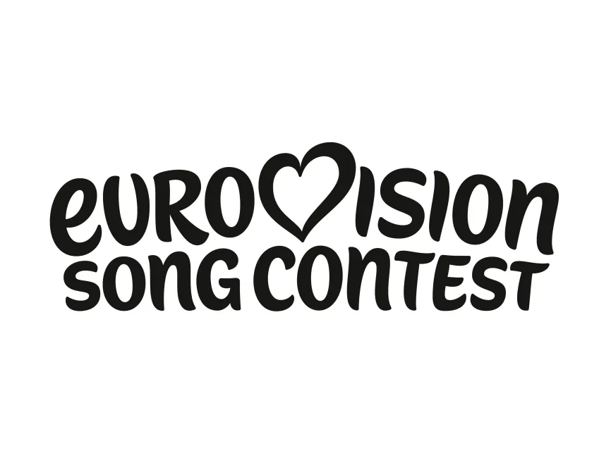
Eurovision Song Content Logo
Information
Description
Eurovision Song Content new 2025 Logo in SVG, AI, PDF vector formats and transparent PNG
The Eurovision Song Contest is one of the longest-running and most-watched international television events in the world It was established in 1956 by the European Broadcasting Union (EBU) as a way to bring European nations together through music and cultural exchange in the post-war era Over the decades, Eurovision has grown from a modest song competition into a global phenomenon, attracting participants from over 40 countries including Australia and Israel
Eurovision is not just a music competition; it has become a vibrant cultural movement that celebrates diversity, unity, and self-expression With over 180 million viewers tuning in annually, the Eurovision brand has become a symbol of inclusivity, entertainment, and pan-European collaboration
The new Eurovision Song Contest logo, as seen in the latest rebranding, maintains the core identity that fans recognize but introduces subtle refinements to stay modern and relevant While past iterations have varied slightly over the years to reflect the changing aesthetics of host nations, the consistent elements—especially the heart symbol—remain iconic
The heart replacing the "v" in "Eurovision" continues to be the central and most emotionally resonant part of the identity In previous versions, the heart often contained a national flag representing the host country, but the latest version appears in a monochrome, minimalist design, possibly to allow flexible application across various themes
The Eurovision Song Contest logo is a custom wordmark logo that integrates hand-drawn, playful typography with an emotional visual symbol Here's a closer breakdown of its design elements
Typography:The font is rounded, fluid, and friendly—suggesting creativity, openness, and joy The handwritten style gives the brand a human and personal touch, perfectly in line with a show that thrives on emotional performances and personal expression
Color:The new logo appears in black and white, reflecting a neutral base that allows each year’s branding (host country, theme, and stage design) to be layered on top without conflict This minimalist version of the logo is more versatile, adaptable, and contemporary The lack of vibrant colors in the logo itself is likely intentional to avoid limiting its application
Heart Symbol:Replacing the “v” in "Eurovision," the heart shape remains the most powerful brand icon It stands for unity, love, and cross-border connection Its simplicity in the current version reinforces timelessness and broad emotional appeal The heart is also highly adaptable—perfect for inserting country flags or themed colors, making it an ever-evolving symbol of the contest's identity


User reviews