

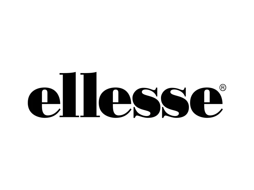
Ellesse Wordmark Logo
Information
Description
Ellesse is a renowned Italian sportswear brand founded in 1959 by Leonardo Servadio The brand gained popularity for blending sportswear functionality with fashionable designs, making it a staple in casual and athletic apparel Known for its tennis and ski-inspired clothing, Ellesse has established itself as a symbol of retro sports fashion, often associated with the 1980s and 1990s streetwear culture
The Ellesse logo has remained relatively consistent over the years, maintaining a distinct visual identity that combines typography with a unique emblem The most recognized version includes
While the brand has experimented with minor adjustments in logo styling, the core elements—bold typography and the iconic emblem—have remained unchanged, ensuring brand recognition across decades
The "ellesse" wordmark is designed in a bold, serif typeface, giving it a classic yet contemporary feel The lowercase letters create a friendly and approachable aesthetic, while the thick, curved strokes add a sense of strength and reliability
Ellesse often uses a black-and-white version of the logo for branding purposes, but the brand is best recognized for its orange and red semi-circle emblem These colors symbolize energy, passion, and dynamism, aligning with the brand’s sporty and youthful image
The semi-circle emblem is a defining feature of Ellesse’s logo It represents two key elements
This unique combination of symbols sets Ellesse apart from other sportswear brands by emphasizing its deep-rooted history in both tennis and ski fashion
The Ellesse logo is a perfect blend of simplicity, heritage, and modernity Its bold typography and distinctive emblem make it instantly recognizable, while its color palette conveys energy and passion As a result, the logo effectively communicates the brand’s commitment to stylish, high-quality sportswear




User reviews