
Ding Logo
Information
Description
Ding is a UK-based technology company that focuses on creating smart home products, primarily smart doorbells Founded with the mission to make home technology simple, intuitive, and beautifully designed, Ding’s flagship product is a minimalist, Wi-Fi-enabled doorbell that allows users to talk to visitors from anywhere via their smartphone The brand positions itself as a human-centered alternative in a space often dominated by cold, tech-heavy solutions
Ding emphasizes elegant design, easy functionality, and emotional intelligence in home security — helping people stay connected to their homes in a thoughtful, unobtrusive way
The previous Ding branding was clean but relatively understated The newly unveiled logo represents a bold step forward — it’s more expressive, more memorable, and much more aligned with Ding’s user-friendly ethos
This redesign aligns with the growing trend in tech branding where personality and warmth are prioritized over sterile professionalism Ding wants to be seen not just as a device company, but as a trusted, approachable presence in the home
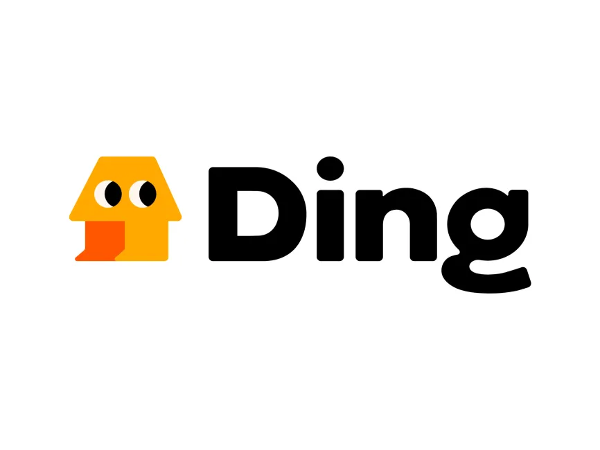
The most striking feature of the new Ding logo is the illustrated character-like symbol placed to the left of the wordmark This yellow shape resembles a simplified house with eyes, which gives it an anthropomorphic, mascot-like feel The triangular roof and square base represent a home, while the two large eyes and a stylized orange “tongue” or “door chime” evoke personality and emotion
This design communicates friendliness, approachability, and a touch of playfulness — all while maintaining a strong connection to the home and communication theme It creates a memorable visual association and could easily evolve into a recognizable brand mascot
The wordmark "Ding" is set in a bold, rounded sans-serif typeface The font is custom or heavily modified, especially with the playful curvature of the "g", which mirrors the soft, welcoming tone of the brand The use of all-lowercase characters would have made the brand even softer, but the decision to capitalize only the “D” keeps it slightly more formal, balancing approachability with credibility
The typography is clean and modern, perfectly suited for digital interfaces and mobile apps, while still feeling distinctly human
User reviews