
De Dietrich Logo
Information
Description
De Dietrich is a historic French brand renowned for its excellence in engineering and manufacturing, with a legacy that dates back to 1684 The brand was originally established in Alsace, France, and is one of the oldest industrial companies in the world Over the centuries, De Dietrich has been involved in multiple sectors including railway manufacturing, industrial equipment, and most notably, high-end kitchen appliances
Today, De Dietrich is celebrated for its innovation in premium home appliances, blending cutting-edge technology with refined design The brand is known for pushing the boundaries of culinary technology while maintaining a deep respect for its French heritage, craftsmanship, and aesthetics
The De Dietrich logo has undergone several transformations throughout its long history The earlier iterations incorporated traditional elements such as heraldic symbols and coats of arms, which reflected the company’s deep-rooted legacy More recent versions began to emphasize sleekness and modernity, aligning the visual identity with the luxury and technological innovation of the brand
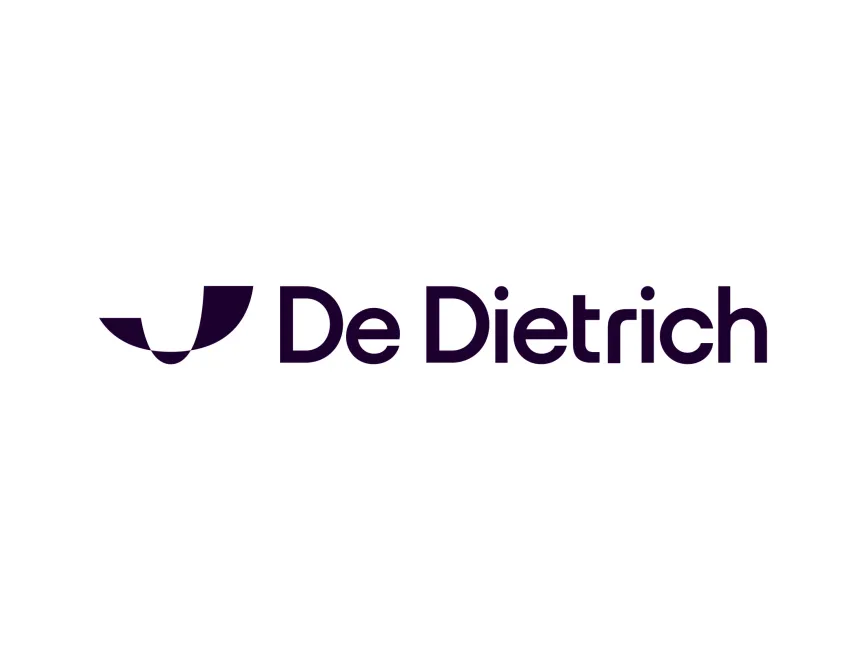
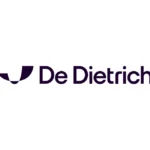
The new De Dietrich logo represents a bold step into contemporary design, emphasizing simplicity, elegance, and symbolic abstraction It aligns perfectly with the brand’s refined image and premium positioning in the market
The new logo introduces a highly stylized, abstract icon positioned to the left of the brand name This symbol is open to interpretation but visually resembles a geometric vessel or a stylized flame, which subtly connects to the world of cooking, heating, and energy The abstract shape also evokes a sense of movement and balance, indicating innovation and precision — key values in De Dietrich’s design and engineering philosophy
Its minimalist, curved forms give it a futuristic look, while the symmetry communicates stability and harmony It’s a refined representation of the modern, sophisticated technology the brand embodies
The wordmark "De Dietrich" is presented in a clean, rounded sans-serif typeface The font choice is sleek and modern, reinforcing the brand’s commitment to forward-thinking design Rounded corners of the letters project warmth and approachability, while the geometric styling retains a sense of engineering precision
The consistent stroke weight and clear spacing enhance readability and give the logo a luxury tech feel — very much in line with the high-end appliance market
User reviews