
Dallas Wings Logo
Information
Description
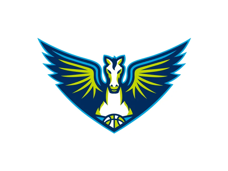
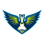
The Dallas Wings, a professional women's basketball team in the WNBA (Women's National Basketball Association), have a logo that perfectly encapsulates their identity, strength, and spirit The team, based in Arlington, Texas, embraces a bold and modern visual representation that reflects both power and agility
The Dallas Wings were founded in 1998 as the Detroit Shock and later relocated, rebranding themselves as the Tulsa Shock in 2010 before moving to Dallas-Fort Worth in 2016, adopting the Wings identity The franchise has a rich history, including multiple WNBA Championships during its time as the Detroit Shock
The team's current branding draws inspiration from Dallas’s aviation history, the legendary Pegasus symbol, and the city's bold, competitive spirit
Since their rebranding to the Dallas Wings in 2016, the team has maintained a strong, winged iconography in their logo
The logo is structured in a V-shaped design, symbolizing flight, freedom, and upward movement—all qualities that align with the Wings' competitive nature
The Pegasus, a mythical winged horse, is the central figure of the logo, representing
The basketball at the base of the logo further reinforces the team’s sport and purpose
The logo utilizes a three-tone color scheme, creating a bold and eye-catching look



User reviews