
Caramelo Hotels Logo
Information
Description
Caramelo Hotels is a modern hospitality brand that positions itself as stylish, vibrant, and uniquely welcoming While relatively new in the hotel industry, Caramelo Hotels aims to offer a fresh and elevated experience through design-driven spaces, curated interiors, and a warm, playful brand personality The brand appeals to lifestyle-conscious travelers looking for comfort, design, and a touch of fun during their stay
Caramelo Hotels operates in the boutique hotel segment, focusing on memorable aesthetics and personalized service rather than large-scale, standardized experiences While detailed corporate history or founder information is limited publicly, the identity of the brand is strongly tied to creative hospitality, bold visuals, and contemporary luxury
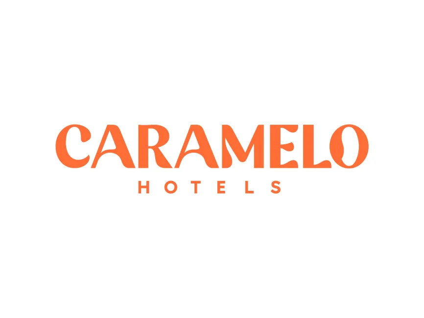
The Caramelo Hotels logo stands out with its expressive typography and energetic color palette It communicates charm, creativity, and hospitality — all integral qualities for a modern lifestyle hotel brand
The logo is entirely typographic, composed of two text elements
This layout emphasizes the brand name while grounding it with a functional subtext that clarifies the industry category
The main wordmark features highly stylized letterforms with unique curves and angular serifs Letters such as the “A,” “M,” and “O” have playful, exaggerated shapes that feel warm and dynamic The curvature of the characters adds a whimsical tone that reflects the “caramel” reference — smooth, sweet, and inviting
The typeface used in "CARAMELLO" is custom or heavily modified, blending retro inspiration with contemporary style It’s a high-contrast serif typeface, with thick strokes and thin tapers that give the wordmark a theatrical and lively rhythm
In contrast, the word "HOTELS" is set in a modern, sans-serif font with wide tracking (letter spacing), in uppercase This choice offers a clean, minimalist counterbalance to the expressive main title, ensuring legibility and visual structure
User reviews