

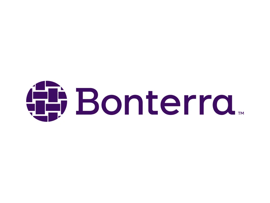
Bonterra Logo
Information
Description
Bonterra is a technology company that empowers social good organizations through purpose-built software solutions It was formed in 2022 from the unification of four mission-driven technology providers: CyberGrants, EveryAction, Social Solutions, and Network for Good Backed by Apax Partners, Bonterra’s goal is to accelerate the impact of nonprofit and philanthropic efforts by offering an integrated, data-driven platform to support fundraising, donor engagement, grantmaking, and case management
Headquartered in the United States, Bonterra operates at the intersection of tech and social impact, providing tools to over 15,000 nonprofit organizations, public agencies, and philanthropic institutions
The Bonterra brand and logo were introduced in 2022 as part of a larger rebranding initiative to unite several leading social good tech providers under a single umbrella The logo was designed to symbolize connection, community, and collective impact — core values that define Bonterra’s mission This rebranding marked a significant shift from individual company identities toward a unified visual and cultural identity
The Bonterra logo is a refined and intentional piece of brand design that captures the company’s commitment to collaboration and positive impact in the social sector
The logo consists of two key elements
The emblem is composed of an abstract woven pattern enclosed within a circle The weaving motif symbolizes interconnectedness, collaboration, and strength through unity, resonating deeply with the mission of bringing together people, data, and organizations to create lasting social impact The geometric nature of the pattern creates a sense of structure and order while remaining open and welcoming
The circle, as a universal symbol of wholeness and inclusion, reinforces Bonterra’s role as a unifying force in the nonprofit technology landscape
The wordmark uses a clean, sans-serif font with modern and humanistic qualities The typography is lowercase, except for the initial capital B, giving the logo a friendly and approachable tone while maintaining professionalism The spacing between the letters is generous, making the wordmark easy to read across all platforms
User reviews