
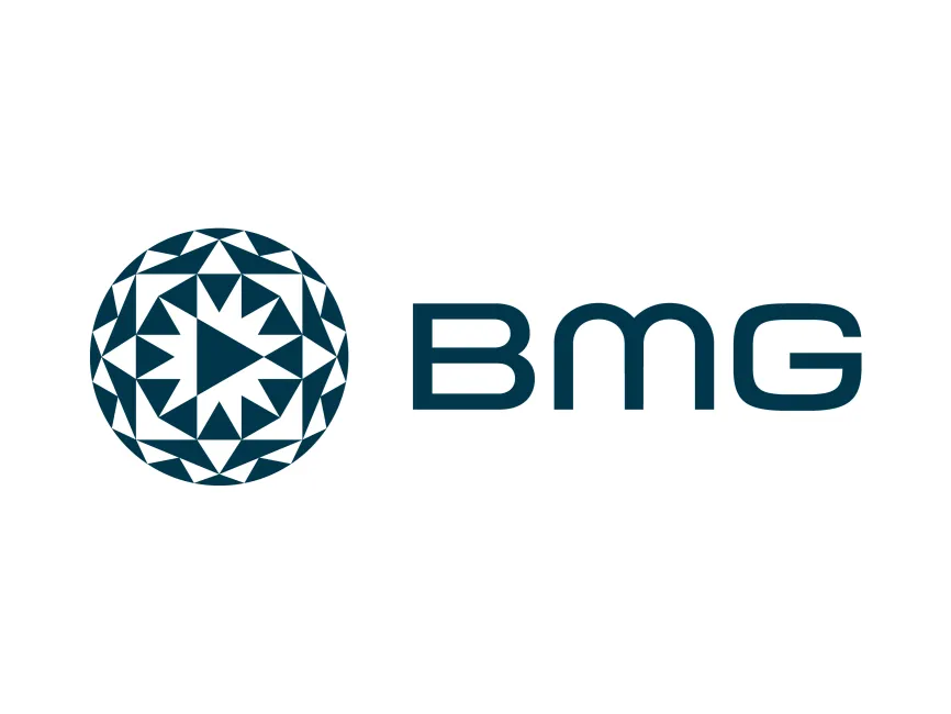
BMG Logo
Information
Description
BMG, also known as BMG Rights Management, is a global music company headquartered in Berlin, Germany It was established in October 2008 by the media conglomerate Bertelsmann after the original BMG (Bertelsmann Music Group) was merged with Sony Music The reimagined BMG was born with a modern, digital-first approach to music rights, focusing on transparency, fairness, and service for artists and songwriters Today, BMG operates as one of the world's largest music companies, offering music publishing and recording rights under one roof Its client roster includes both legendary icons and emerging artists, reflecting a diverse and global reach
Historically, BMG logos have been simple, relying heavily on bold sans-serif typography to convey authority and professionalism The recent rebranding marks a significant evolution in the company’s visual identity The newly unveiled logo takes a more dynamic and artistic approach, aligning with BMG’s role as a forward-thinking, artist-centric music brand
This update reflects a broader trend in the music industry where branding is becoming more vibrant and abstract, moving away from corporate rigidity toward creative expression
The new BMG logo features two main components: a geometric symbol on the left and the "BMG" logotype on the right
The circular symbol is a standout feature in the new logo It is composed of a highly stylized mosaic of triangles arranged in a radial symmetry, creating a dynamic visual rhythm At the center, a triangle points to the right, symbolizing the universal “play” button — an immediate connection to music and media The surrounding pattern resembles a kaleidoscope or even a stylized vinyl record or speaker cone, subtly nodding to BMG’s musical foundation
This geometric design communicates motion, energy, and creativity It successfully combines modern digital aesthetics with timeless symbolism
The “BMG” logotype is presented in a sleek, custom sans-serif font with rounded corners The design is minimalist and contemporary, offering a clean and legible presence The smooth curves of the letters provide a sense of approachability, while the bold weight gives the logo strength and visibility in digital and print formats
The letter “M” is particularly distinctive, with its arch-like shape giving it a stylized, almost futuristic appearance This subtle customization adds uniqueness without compromising readability
User reviews